The simplistic design with only a few intentionally placed hints of color is not only aesthetically pleasing but easier to digest as a reader. The design is intended to be clean, but not harsh or uninviting. The color palette switches from topic to topic, making the process of absorbing information easier. The overall design structure allows for a simple and intuitive flow of understanding as the reader moves through the booklet. I base my work metric of good work in finding the balance of designing for function as well as aesthetics. This easy and understated design allows a reader to enjoy the booklet without the design getting in the way. After all, sometimes the best design is transparent.
Could your company use more practical and pretty designs? Let us develop the right look for you.
Contact Us
Let's build a tribe together
Ideas, Ideas, Ideas

Before They Take a Bite, They Visit Your Feed
Discover how thoughtful restaurant content can help guests see the food, feel the experience, and decide to visit.
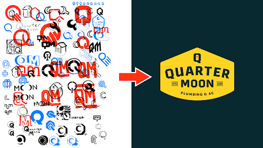
How to Build a Brand From Scratch
Learn the full process of building a brand, from logo sketches and research to website design and brand guide development.

How Social Media Advertising Is Changing in 2026
Discover how brands can adapt to emerging social platforms with content that feels native, useful, and audience-aware.
Featured Work
We don’t just deliver - we make a difference.
Here’s a look at some of our most impactful branding, web, and campaign work. These aren’t just projects - they’re proof of what’s possible when bold ideas meet the right tribe.
.jpg)