
Your homepage is the digital front door to your brand and like any great first impression, it should be both beautiful and purposeful. In a world where users decide in seconds whether to stay or bounce, your homepage has one job: convert curiosity into connection.
So, what separates a high-converting homepage from one that just looks good?
1. A Headline That Speaks to Humans (Not Just Algorithms)
Your headline is the first thing visitors read make it count. It should clearly say what you do and why it matters. Avoid vague slogans and go straight for clarity with personality.
Example: Instead of "Building Digital Experiences," try "We Design Websites That Turn Clicks Into Clients."
Test multiple headlines. Even small wording tweaks can increase conversions by 20% or more.
2. Visual Hierarchy That Guides the Eye
A great homepage feels easy to navigate because the design quietly leads you where to look next. Visual hierarchy using size, color, and placement helps highlight what matters most.
- Primary CTA (like "Get a Quote" or "Work With Us") should be above the fold.
- Use whitespace to let your design breathe.
- Keep navigation simple. Five to seven main menu items max.
Think: Clean, intentional, scroll-worthy.
3. Clear, Compelling Calls to Action
Every homepage should guide users toward one main goal, whether that’s scheduling a call, exploring services, or signing up for a newsletter. Scatter CTAs naturally throughout, but keep them consistent in tone and action.
Avoid: Jargon-heavy or confusing buttons like "Learn More."
Try: "Let’s Build Your Brand" or "Start Your Project."
4. Trust Signals That Build Credibility
People need to feel safe before they buy, click, or inquire. Showcase proof early and often:
- Client logos or testimonials
- Case study highlights
- Awards, certifications, or press mentions
- Data points (e.g., "Trusted by 200+ Brands")
Trust isn’t optional, it’s conversion currency.
5. Copy That Connects, Not Just Informs
Your homepage copy should sound like a conversation, not a brochure. Write like you’re talking to your best-fit client. Use short paragraphs, strong verbs, and clear benefits.
Example: Instead of "We provide comprehensive marketing solutions," try "We help brands grow through bold creative and data-driven strategy."
6. Strategic Use of Imagery and Video
Visuals aren’t just decoration they’re storytelling tools. Use photography, graphics, or motion to communicate your brand’s vibe and values.
- Avoid generic stock photos.
- Use team or product imagery for authenticity.
- Add subtle motion or animation to guide the user journey.
Remember: every visual element should reinforce your brand story.
7. Performance and UX Matter More Than Ever
Even the best design fails if your page takes forever to load. Speed, mobile responsiveness, and accessibility are table stakes.
Quick Fixes:
- Optimize image sizes.
- Test your site on multiple devices.
- Make sure text contrast meets accessibility standards.
Your site should look and feel effortless because behind the scenes, it’s anything but.
Final Thought: Form + Function = Conversion
A high-converting homepage isn’t built overnight. It takes strategy, testing, and an understanding of what your audience actually needs.
Great design draws people in. Great strategy keeps them there.
Ready to turn your homepage into your hardest-working employee? Let’s build your tribe.
Let's build a tribe together
Ideas, Ideas, Ideas
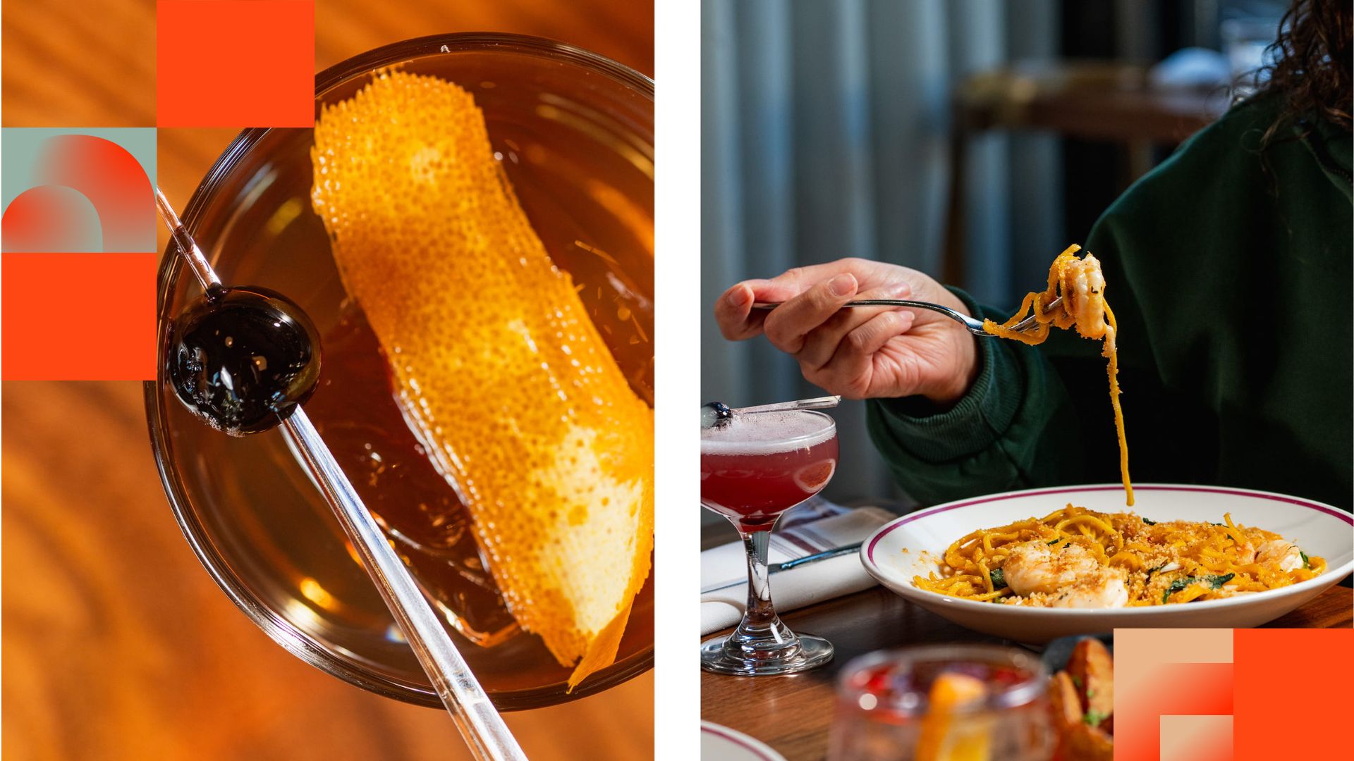
Before They Take a Bite, They Visit Your Feed
Discover how thoughtful restaurant content can help guests see the food, feel the experience, and decide to visit.
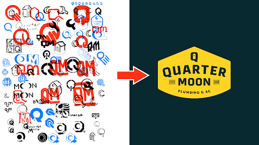
How to Build a Brand From Scratch
Learn the full process of building a brand, from logo sketches and research to website design and brand guide development.

How Social Media Advertising Is Changing in 2026
Discover how brands can adapt to emerging social platforms with content that feels native, useful, and audience-aware.
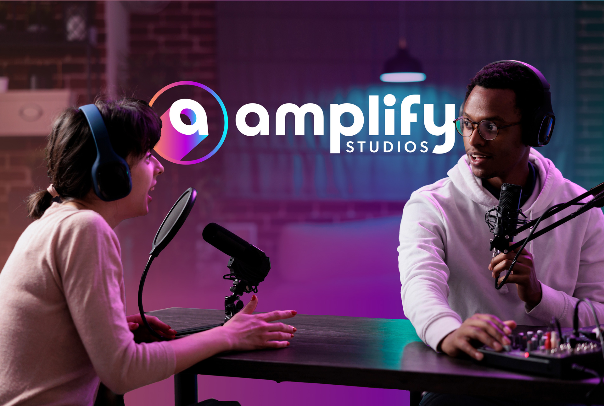
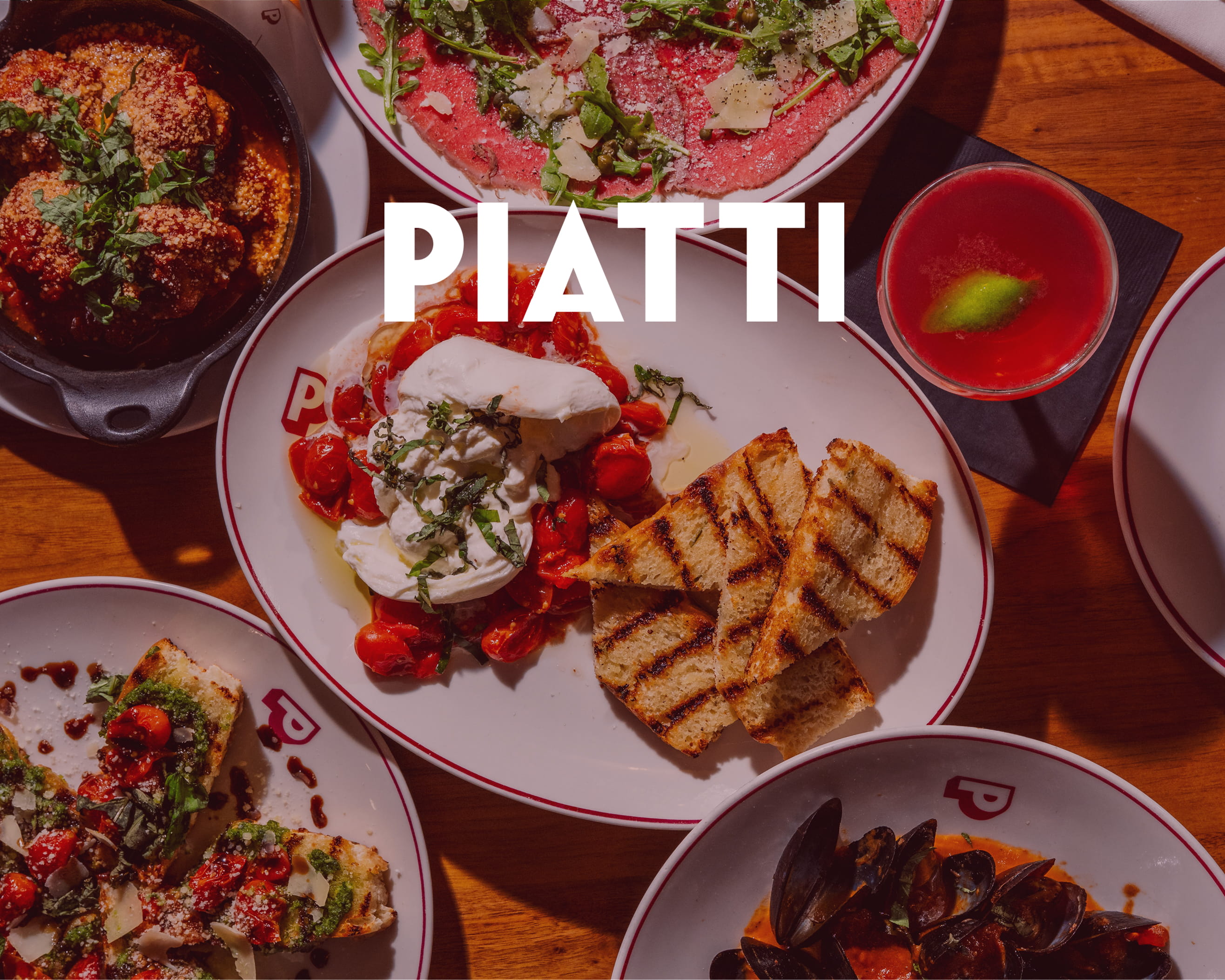
Featured Work
We don’t just deliver - we make a difference.
Here’s a look at some of our most impactful branding, web, and campaign work. These aren’t just projects - they’re proof of what’s possible when bold ideas meet the right tribe.


.jpg)
.jpg)