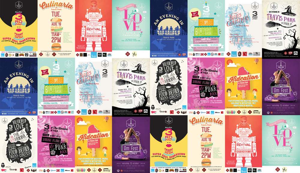
The Breath of Design: White Space Wonders
In the realm where creativity meets clarity, white space reigns supreme. It’s not merely emptiness; it’s the canvas on which our designs dance. Like pauses in a symphony, white space guides eyes and emphasizes messages.
Minimalism: A Palette of Purpose
When colors whisper rather than shout, they speak volumes. Limiting hues isn’t restrictive; it’s liberating, allowing each shade to tell its tale more profoundly.
Typography Talks
In simplicity’s domain, every letter tells a story. Choose typefaces with purpose and let them be your design’s voice.
The Less is More Mantra
Stripping back to essentials isn’t minimalism for minimalism’s sake—it’s about focusing on what truly matters.
Conclusion: The Mastery of Restraint
Simplicity isn’t just an aesthetic choice; it’s a strategic one. By choosing less, we communicate more—a sophisticated paradox that elevates our designs to resonate deeply with audiences.
Remember, when your next project beckons, consider how less can indeed be more and let your creations make their mark with understated confidence.
For those seeking to harness the power of simplicity in their designs or elevate their brand’s visual identity through masterful restraint, look no further than Tribu—your brand agency in San Antonio. Our expertise lies not just in creating visuals but crafting stories that stick—without sticking out unnecessarily.
Let's build a tribe together
Ideas, Ideas, Ideas
Featured Work
We don’t just deliver - we make a difference.
Here’s a look at some of our most impactful branding, web, and campaign work. These aren’t just projects - they’re proof of what’s possible when bold ideas meet the right tribe.


.jpg)


.jpg)
