
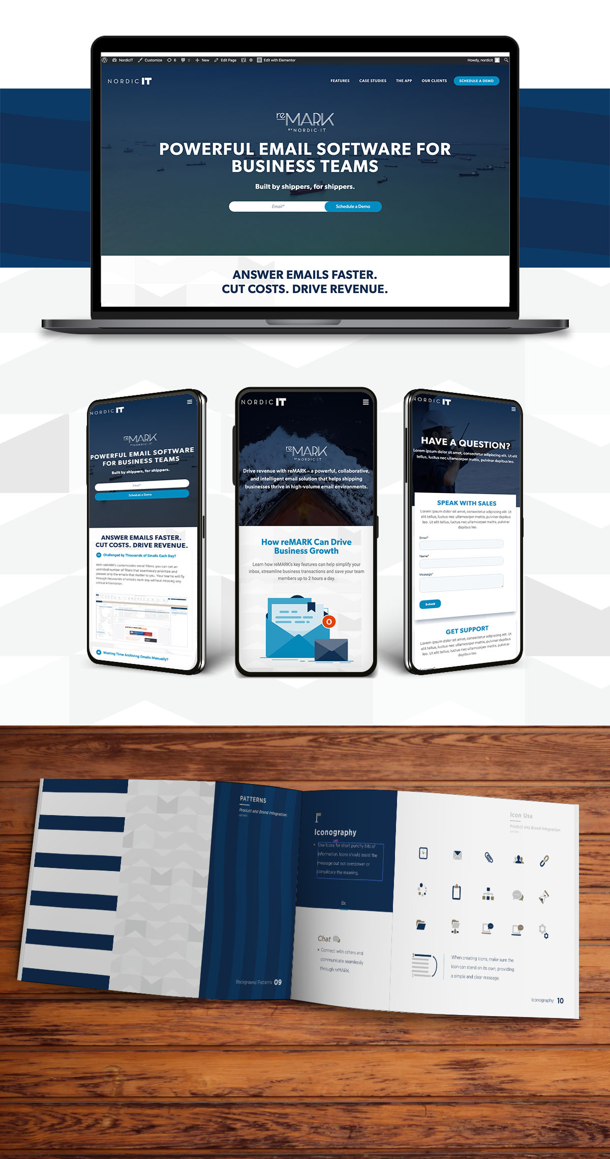
In 2016, mobile internet usage surpassed desktop internet usage for the first time, and this 'mobile-first' trend continues to increase each year. With the rise of social media and mobile apps, more and more of us are using our mobile devices to shop online, conduct research, connect through social media and even do our work.Mobile-first website design is incredibly important to provide a seamless user experience for users. This means the content fits the screen so users don't have to zoom in, the site loads quickly, and provides users with the information they want to see immediately.We partnered with NordicIT for a complete website redesign and rebuild, refreshing their outdated visuals, simplifying their message and building it with a "mobile-first" in mind.
Contact us
Let's build a tribe together
Ideas, Ideas, Ideas

Before They Take a Bite, They Visit Your Feed
Discover how thoughtful restaurant content can help guests see the food, feel the experience, and decide to visit.
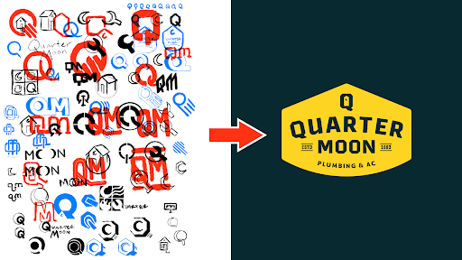
How to Build a Brand From Scratch
Learn the full process of building a brand, from logo sketches and research to website design and brand guide development.
How Social Media Advertising Is Changing in 2026
Discover how brands can adapt to emerging social platforms with content that feels native, useful, and audience-aware.
Featured Work
We don’t just deliver - we make a difference.
Here’s a look at some of our most impactful branding, web, and campaign work. These aren’t just projects - they’re proof of what’s possible when bold ideas meet the right tribe.


.gif)