
Building a webpage that looks good is not easy. It's even harder when you don't have much time to do it. Fortunately, with the help of the right team, it is possible to successfully redesign a homepage. I'm Just a Kid!is an early childhood education center that offers daycare services with a custom curriculum. We started this partnership to quickly acquire new students and grow the I'm Just a Kid!'s brand. With a tight turnaround on this goal, we needed to get started quickly, and the first step was to have a website where we could direct these new students' parents. We changed our process for designing this new homepage. We had to do this because we needed to find a new look and feel for the brand, and also redesign the homepage in a short amount of time. We started with the image below, which is I'm Just a Kid!'s old homepage. /*! elementor - v3.9.1 - 14-12-2022 */
.elementor-widget-image{text-align:center}.elementor-widget-image a{display:inline-block}.elementor-widget-image a img[src$=".svg"]{width:48px}.elementor-widget-image img{vertical-align:middle;display:inline-block}

We updated the homepage design to make it look more up-to-date. We chose colors, patterns, and images that showed both the sophisticated side of an early childhood curriculum and the playful side of being a child. The goal was to create a new design that would be easy for parents to use to decide where to leave their child for 8 hours a day.

The result was a well-designed homepage that encourages viewers to book a tour with I'm Just a Kid!. The smaller design decisions, like the font selection and use of color, were intentional and helped give the site a more modern feel. For example, the font was selected to give the site a more modern feel. The pattern was used lightly and as an enhancement rather than something that would take away from the rest of the design. The information was laid out in an easy-to-understand way, ensuring that viewers receive the important information they're looking for. Lastly, the color scheme was carefully considered, with purple being the predominant color. Yellow and red are used as accents to aid in the overall design. As important as the design was, we completed this project in only two weeks! Our designers collaborated with our web team to not only design the page but to also build and launch it. This homepage is just the beginning for I'm Just a Kid!, and will help them get started as they look to fill in their open spots.
Let's build a tribe together
Ideas, Ideas, Ideas
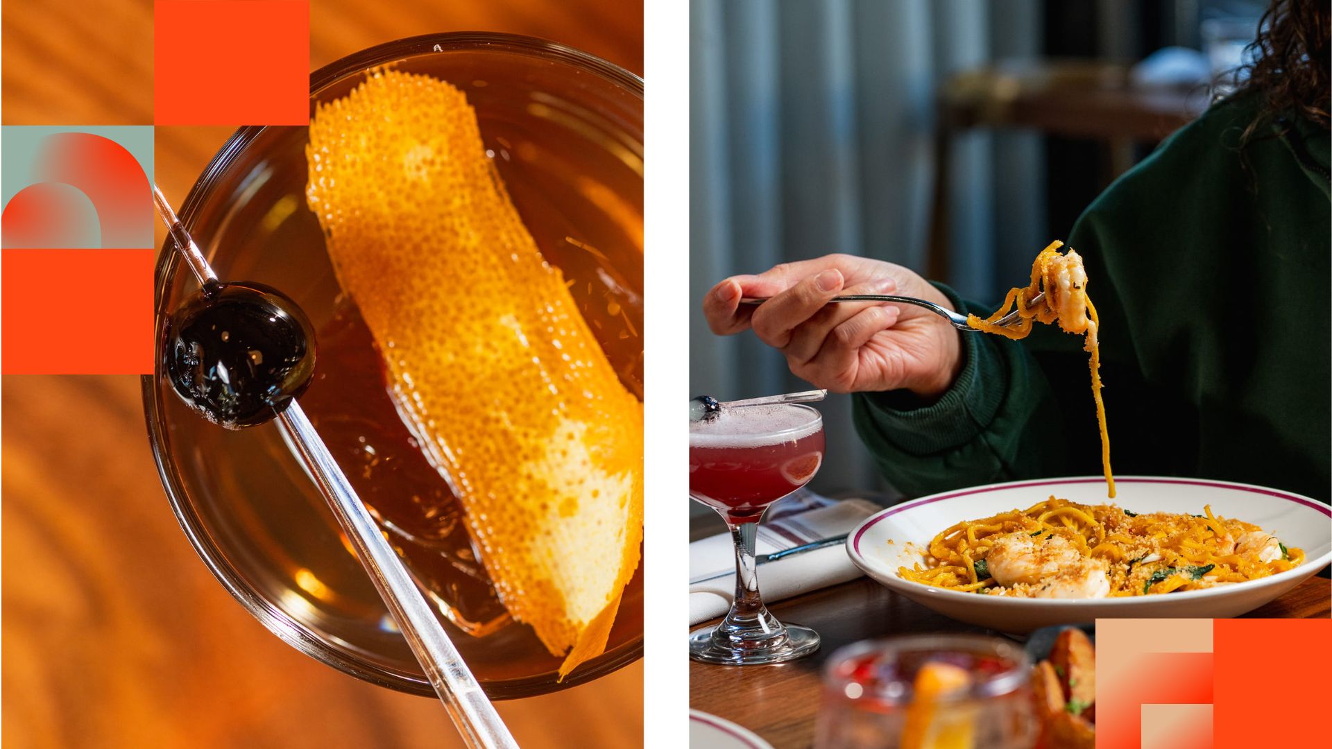
Before They Take a Bite, They Visit Your Feed
Discover how thoughtful restaurant content can help guests see the food, feel the experience, and decide to visit.
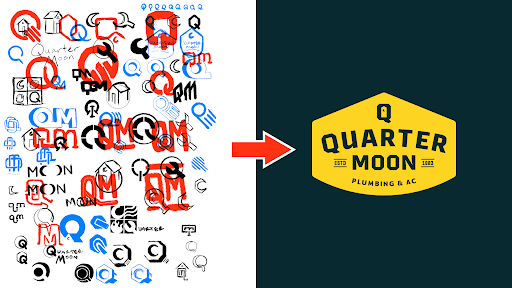
How to Build a Brand From Scratch
Learn the full process of building a brand, from logo sketches and research to website design and brand guide development.

How Social Media Advertising Is Changing in 2026
Discover how brands can adapt to emerging social platforms with content that feels native, useful, and audience-aware.
Featured Work
We don’t just deliver - we make a difference.
Here’s a look at some of our most impactful branding, web, and campaign work. These aren’t just projects - they’re proof of what’s possible when bold ideas meet the right tribe.


.jpg)