My process for designing a logo, website, and everything after
As a graphic designer, I love getting the opportunity to build a brand from scratch. It’s always so exciting to figure out what the best way to visually represent a company is and watch it take form. In all the excitement, however, it’s easy to get ahead of yourself in the process. Or conversely, sometimes you don’t think far enough ahead and trap yourself in a brand that’s not able to scale. Here, I’ll be breaking down the complete process of building a brand and everything that comes with it.
So you have the name and concept of your business, or maybe you already have a business established but the branding needs an overhaul. The first step is the logo. Without a strong, scalable, extendable logo, you're doomed from the start. This is where a lot of startups go wrong. Someone has a great product or service that they need a logo for, so they rush through the process or ask chatGPT for a quick logo and instantly pigeon-hole themselves into a logo that won’t be good for all applications. Logos need to work in one color, work at small or large sizes, and work in all types of environments. This is the part of the process that should take the longest.
When I get assigned a new logo project, my first step is to understand as much about the company/product/service as possible. I talk to the client, do market research, and take a bunch of notes. It might be helpful to gather information on the client’s design preferences or brands they look up to. I also like to get inspiration from sites like Pinterest, Dribbble, or Behance to see what kind of visual style I’m going for. I will warn that this is where it’s easy to fall into the trap of looking like everyone else in your industry. This is your chance to find what works in your industry and where you can differentiate yourself (heavy emphasis on that second part). I pull together some mood boards and start looking at some details that stick out to me - specific typefaces, image treatments, patterns, colors, etc.
Now I have all my research, my brain is primed, and I’m finally ready to put pen to paper (or apple pencil to iPad). I like to start with as many sketches as I can possibly push out. I’m talking 50 to 100. This is where there’s no judging ideas and no polishing, just sketching ideas as quickly as you can to give yourself a large pond to fish from. Once you feel completely tapped and you can’t possibly draw any more sketches, take a couple days away and come back and draw some more. Once you really don’t have any more, you start looking at what sticks out. You have to be in-tune with your gut here and don’t overthink anything. What looks cool? What idea excites you most? What feels most right for the brand?
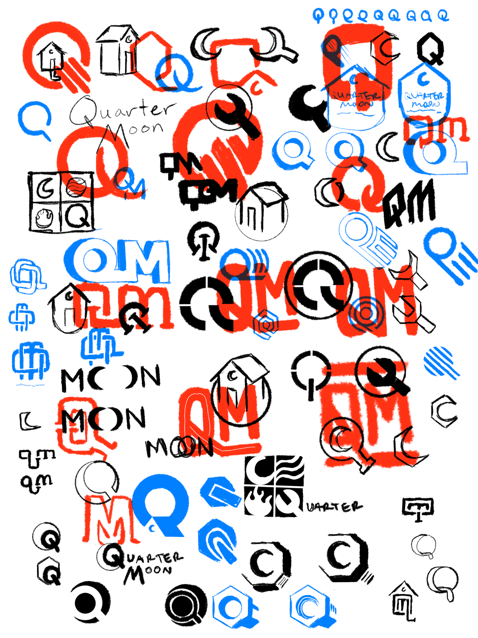
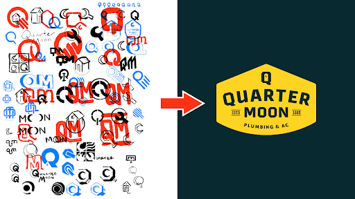
Some of my Quarter Moon Plumbing logo sketches
Pick out around 5-10 of your favorite sketches and bring them into your preferred design software (mine is Adobe Illustrator) and digitize your rough sketches. These also aren’t going to be perfect, but it’s important that you start to see these logo concepts in flat vector shapes. Keep it to black and white - logos have to work in just one color. This also gives you the freedom to mess with the dimensions and corners and curves and start to get your initial sketches more polished. This is where the logo starts to look more real. Keep making variations on variations of each of your ideas and continue to use that gut instinct to feel out what’s working and what ultimately won’t work as well as you originally envisioned.
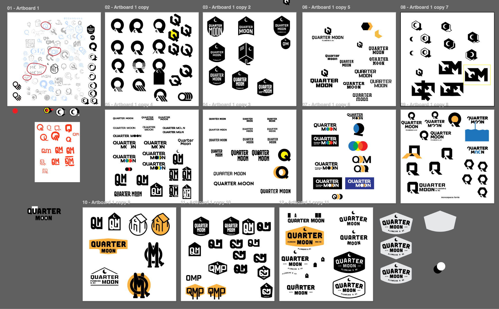
My first round of digital roughs
Once you have 3 or so logo directions you like, now it’s time to fine-tune. This is where you’re supposed to get very detail-oriented and nitpicky. Look at pages and pages of fonts until your brain goes numb, then take a walk and look at more. Look at every pixel, corner, edge. Start thinking ahead about how this brand will look in the real world. Play with different color palettes, patterns, textures, etc. I find it super helpful to put the logo on mock ups that are relevant to the industry. This could be hats, shirts, business cards, water bottles - anything that helps you and the client get a sense of what the logo will look like in real life and in different contexts. It’s surprising how much this can change your logo concept. I also like to start playing with alternate logo layouts. Try a horizontal version, a vertical version, an icon, monogram, or badge. This helps you look ahead and ensure that the logo you’re building has legs and can be flexible.
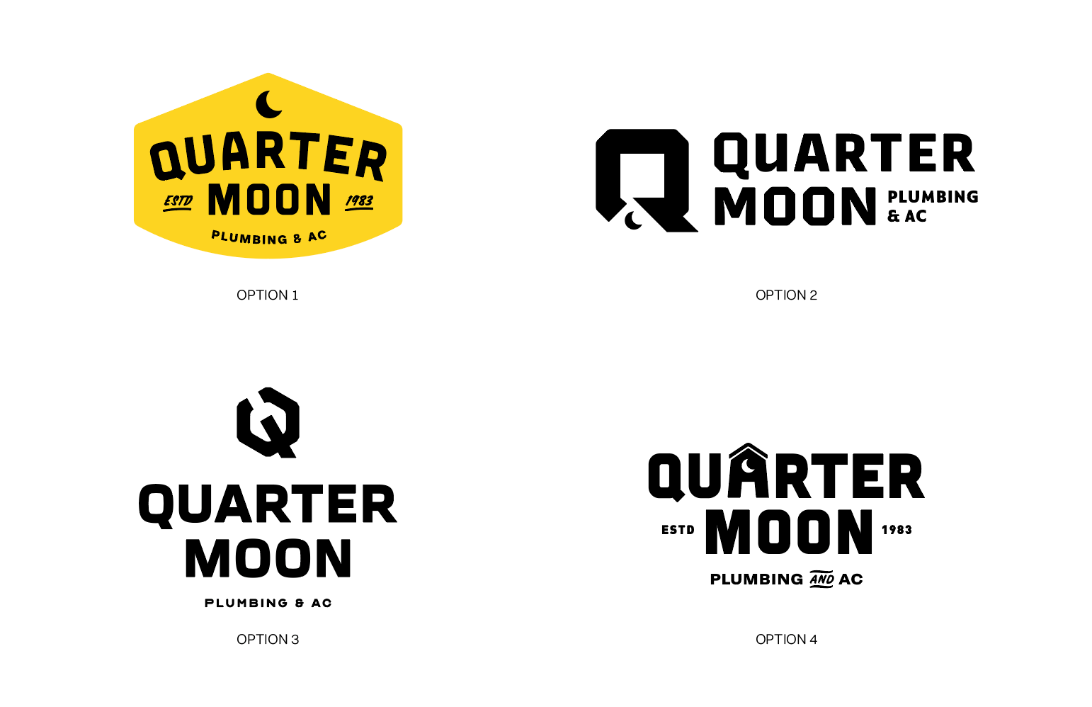
Round 1 presented options
Once you have 3 or so fleshed out logo directions, it’s time to present to the partner. Get as much feedback as you can to go into the next round of revisions, then it’s time to iterate. I look at logos like I look at tattoos. My tattoo artist once told me that when placing a stencil, you have to look in the mirror and immediately have that feeling of “yep, that’s perfect.” Then you get it inked. The client ultimately needs to look at their final logo and love it. It’s got to feel just right, otherwise it’s not done.
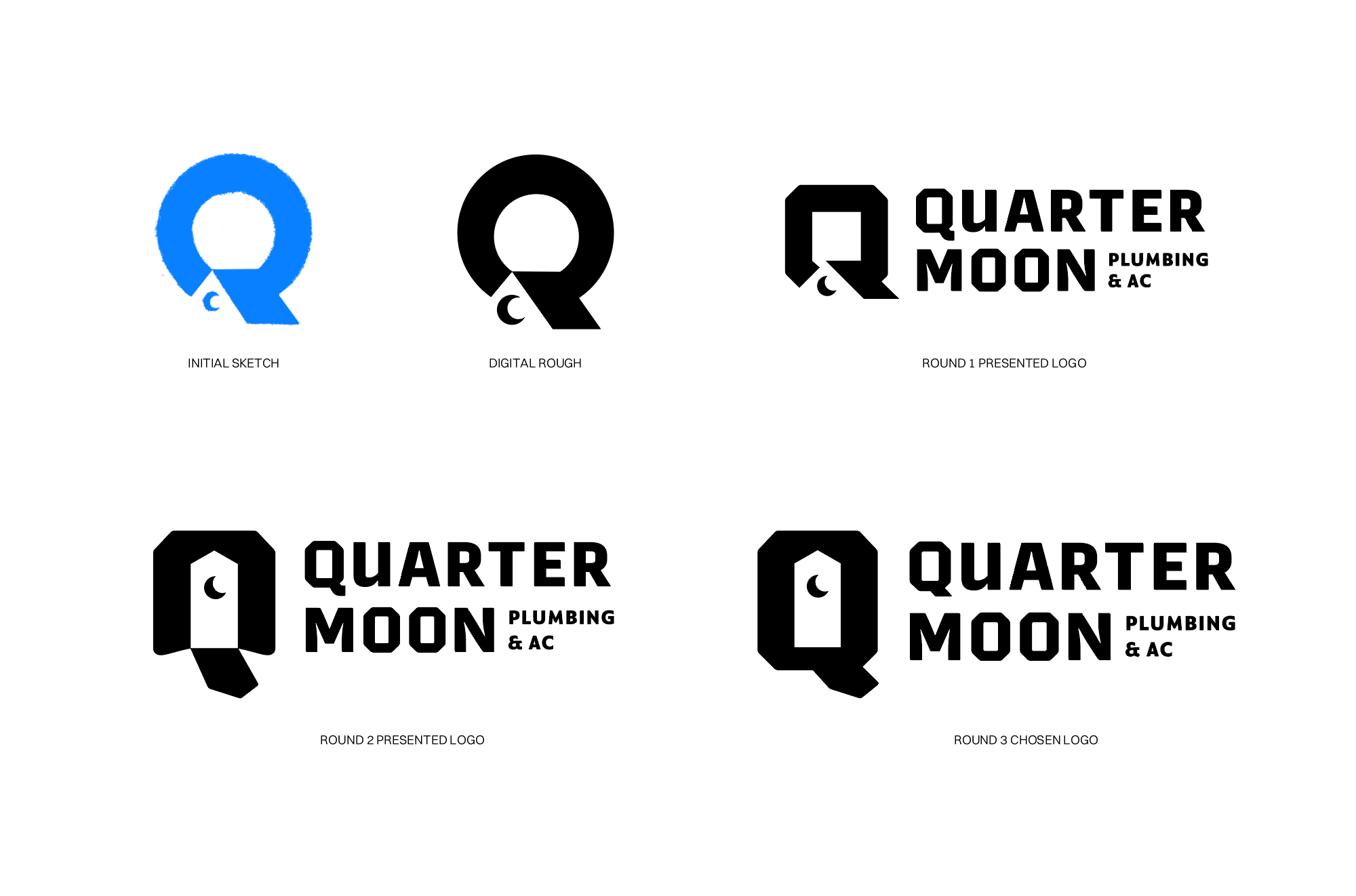
All iterations of the chosen logo direction
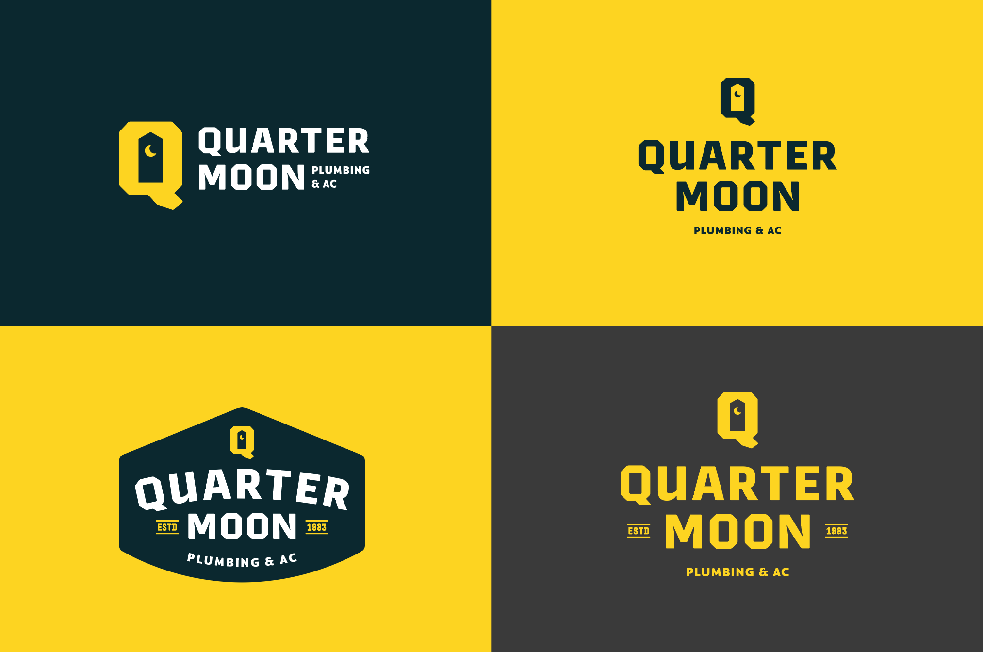
Chosen logo direction variations with color exploration
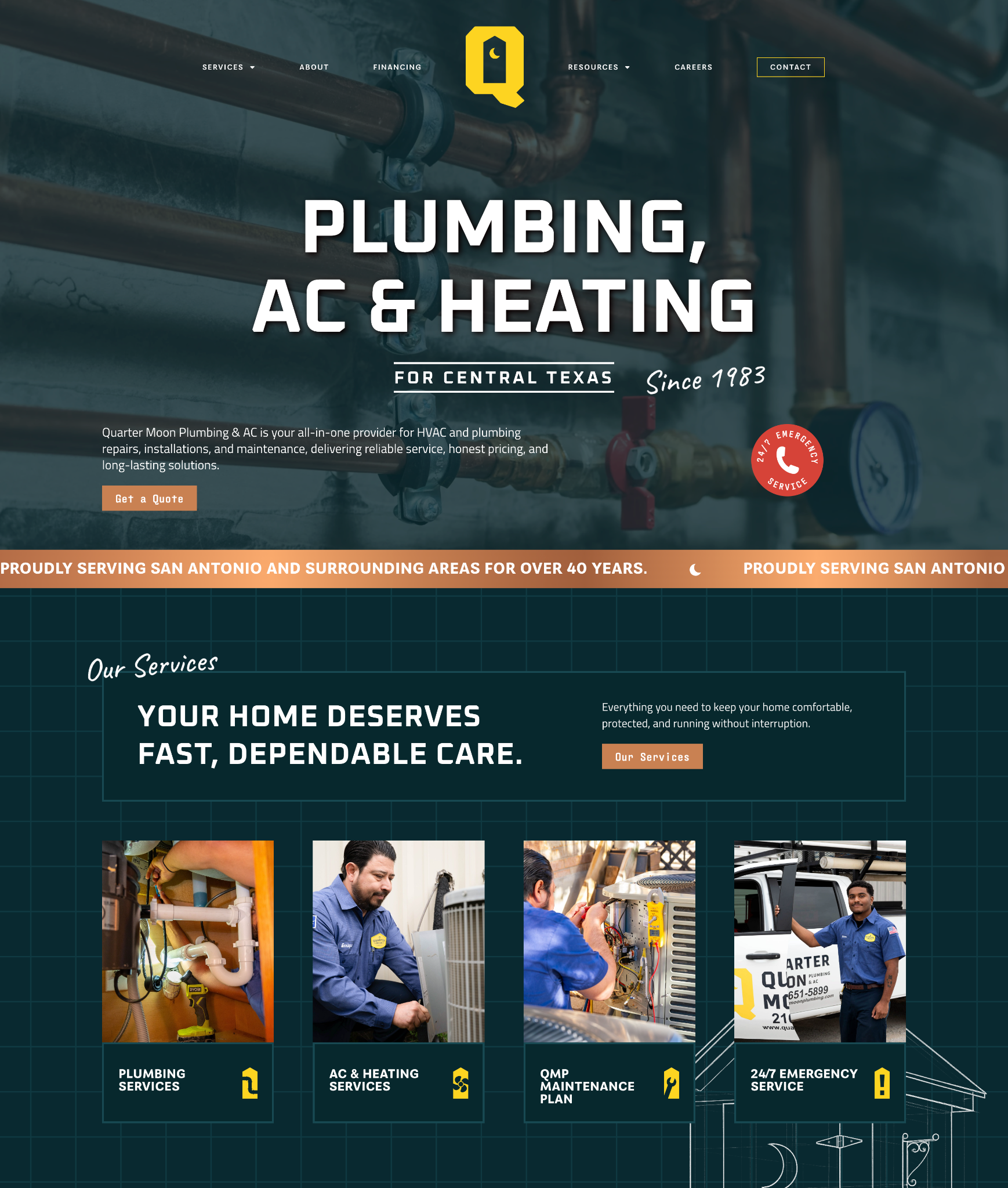
Our next step in building a brand beyond the logo is their website. I like to do a homepage design before anything else because it’s a great way for you and the client to see how the brand comes to life in an interactive setting that uses colors, images, text hierarchy, patterns, animation, and everything else that makes a brand a brand. It’s also a chance to see how the brand visually works with the messaging and tone of voice. This is where you start to figure out your headline fonts, subheads, body copy. This is also where you plan how buttons, labels, and captions work. You get to see how your colors look all together and what kind of fun little elements you can add to make your brand more unique. A homepage is a great way to expand on the work you did for the logo and really turn a logo into a full-fledged brand.
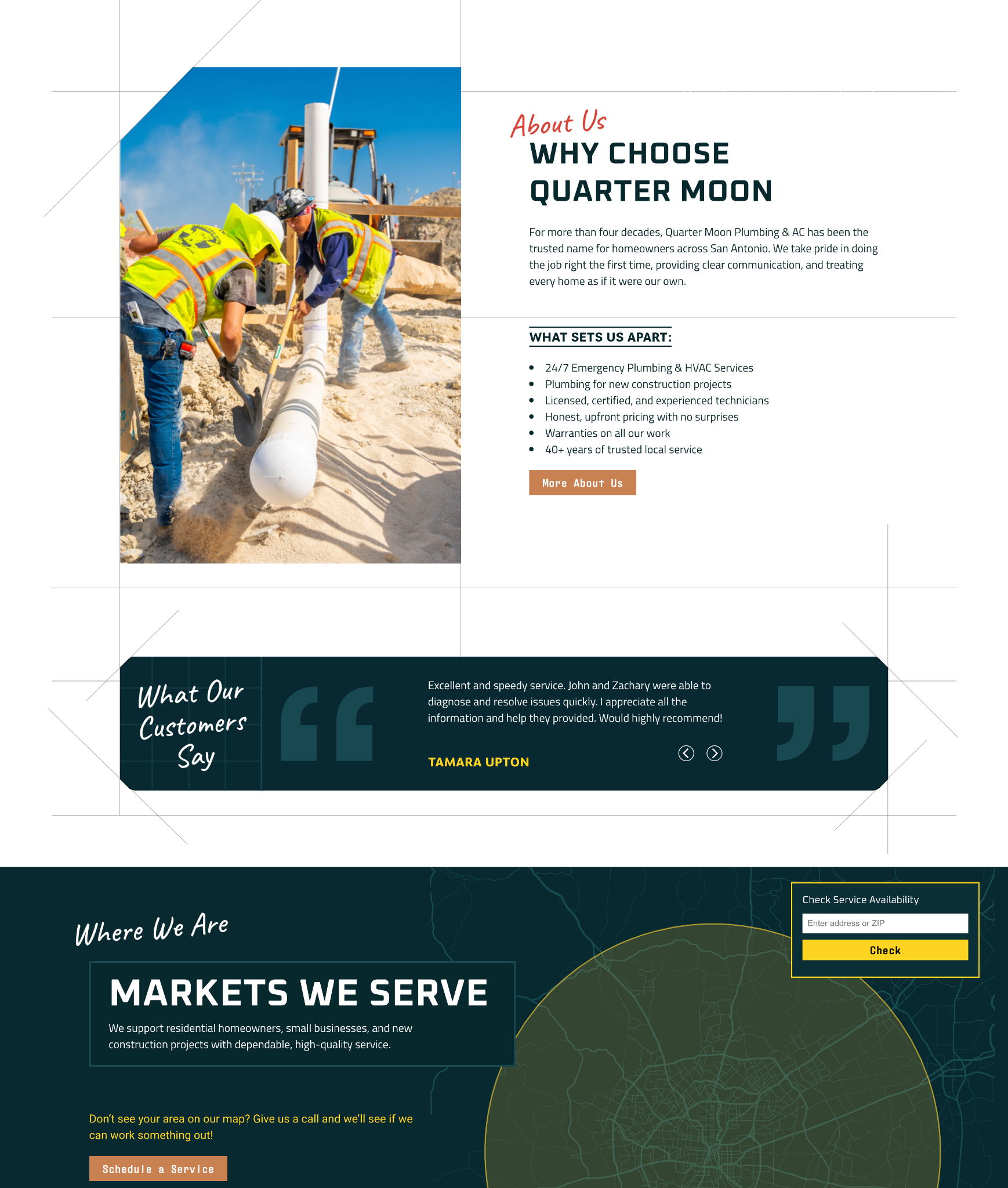
After working on the website and making sure the brand is looking good and the client is happy, I usually work on a brand guide next. This guide is based on the work I did on the website and is a great point of reference for anyone making any sort of creative material for this new brand you worked so hard to bring to life. In any future ads, print material, swag, etc., reference this. And of course, any chance you get to expand the brand in the future without bloating it, do it! Brands are supposed to be able to grow and evolve.
Typography section of the Quarter Moon Plumbing visual guide
The whole process of building a brand can be intimidating, but if you break it down into smaller steps, it becomes a lot more manageable. Plus, you’ll be really thanking yourself later for setting up a brand that’s easy to work with and expand.
Let's build a tribe together
Ideas, Ideas, Ideas
How Social Media Advertising Is Changing in 2026
Discover how brands can adapt to emerging social platforms with content that feels native, useful, and audience-aware.
The Problem With “Our Audience Is Everyone”
See why specific audience insight leads to sharper messaging, stronger creative, and more effective marketing.
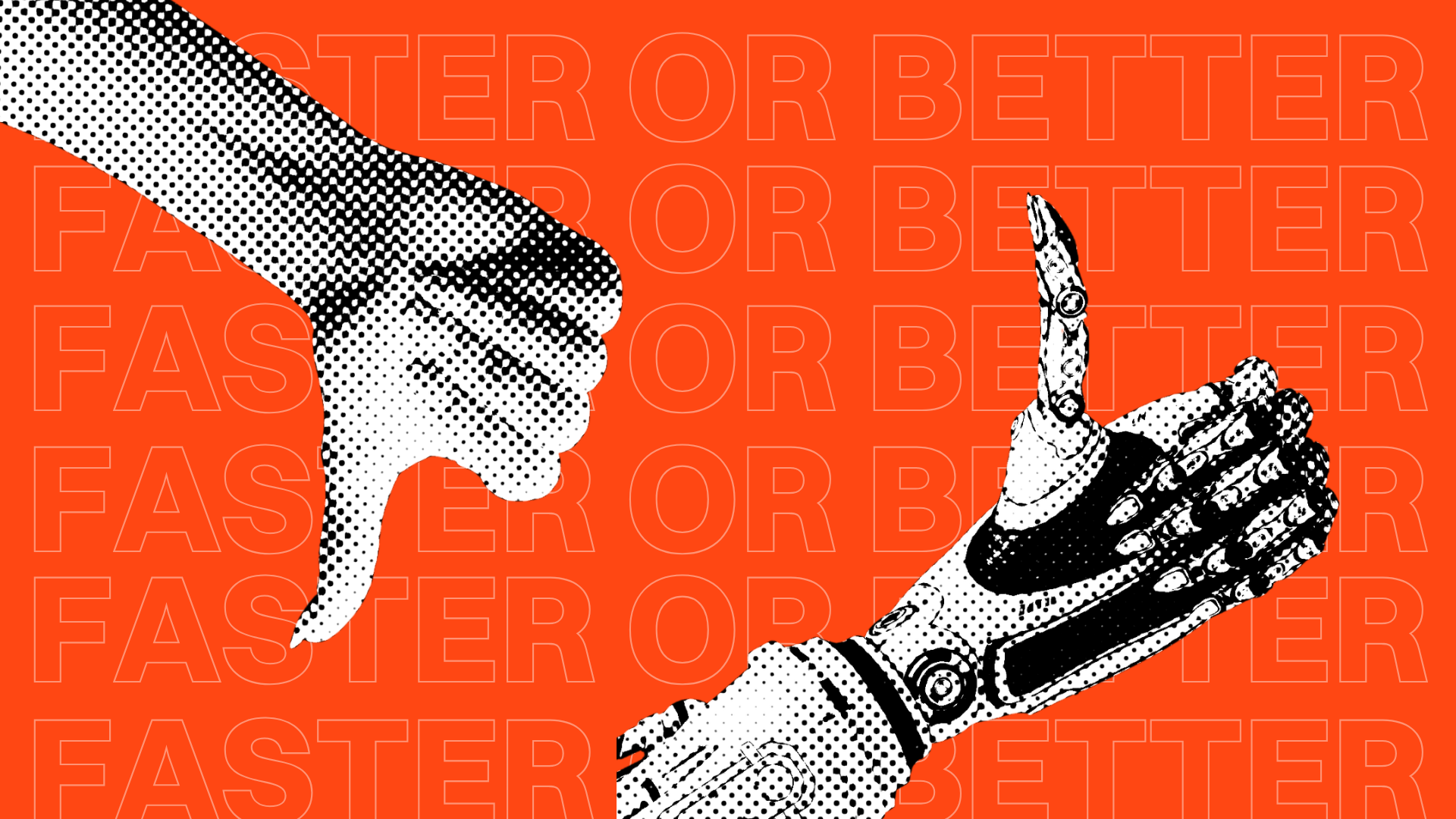
AI Made Marketing Content Faster. It Didn’t Make It Better.
Explore how AI changed content marketing and why strong strategy still matters more than speed or volume.
Featured Work
We don’t just deliver - we make a difference.
Here’s a look at some of our most impactful branding, web, and campaign work. These aren’t just projects - they’re proof of what’s possible when bold ideas meet the right tribe.

.jpg)


.jpg)


