Typography is a design tool that is often overlooked when it comes to converting users into buyers, promoters or even brand ambassadors. When it comes to getting the attention of a user, the majority of marketers stick with what is "safe" such as images, color or video, but that is not always the case, and can lead a lot of user experiences to be confusing or overwhelming. Now, I am not saying that using images, color, etc. as a tool to grab the attention of your audience is wrong. I am simply saying use it wisely. If done correctly, and paired with a beautiful type hierarchy, it can make all the difference in the world. It can be the difference between losing an annoyed user and making a sale.In my opinion the Swiss did this best with a K.I.S.S. (Keep It Simple Stupid). It is often referred to as the International Typographic Style, which is apparent within the works of Josef Müller-Brockmann (seen below) or Max Miedinger, who still to this day has an impact on the lives of everyone with a little typeface he created called Neue Haas Grotesk. You may know it as Helvetica, one of the most widely used fonts in the world and a conversion juggernaut with all its different weights and variations (i.e. light, bold, italic, etc.).


We know typography can enhance any digital marketing effort, but how do we put it into practice? What do you do next? The simple answer is the hierarchy. I'm not just talking about making something bold so it "sticks out" from the rest of the copy. I am talking about hierarchy with a purpose and reason. A wonderful tool I like to use when deciding on my font sizes and leading is the Fibonacci Sequence. Explained as simply as possible the Fibonacci Sequence is a set of numbers that start with a one or a zero, followed by a one, and proceeds based on the rule that each number is equal to the sum of the preceding two numbers. So for reference here are some of the beginning numbers 0, 1, 1, 2, 3, 5, 8, 13, 21, 34, 55, 89, 144, 233, 377, ... Now putting these numbers to use, let's say we have a header that is set to 55, now we need a subheader, let's set that at 21 and last but not least the body copy, I usually go with 13 or 8 depending on the platform.Now we have a baseline for how we can beautify our digital marketing, improve our conversions, put some meaning behind what we create, and put it out into the world. Like any idea or system, there is no "one to rule them all" scenario. Next time you're making that kickass landing page give your typography some love, add some A/B testing and see what gets you the conversions you're looking for.
Do you have a project in mind? Let us help you bring it to life!
Let's build a tribe together
Ideas, Ideas, Ideas
Why Better Creative Is Becoming the New Targeting
Discover why creative is becoming the new targeting in paid ads and how sharper messaging helps brands attract the right audience and drive action.
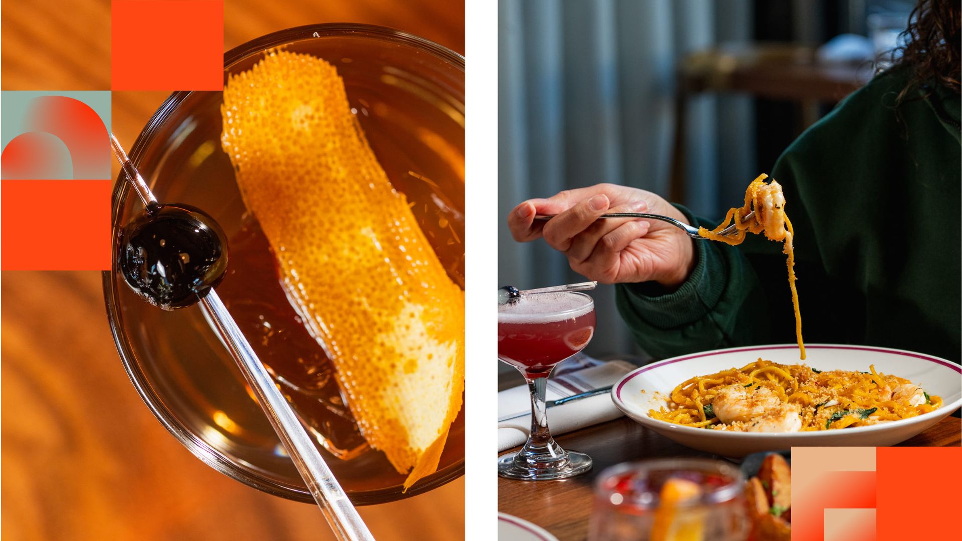
Before They Take a Bite, They Visit Your Feed
Discover how thoughtful restaurant content can help guests see the food, feel the experience, and decide to visit.
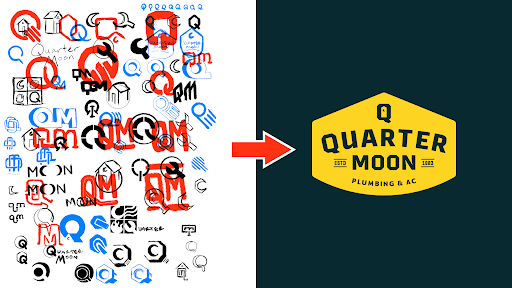
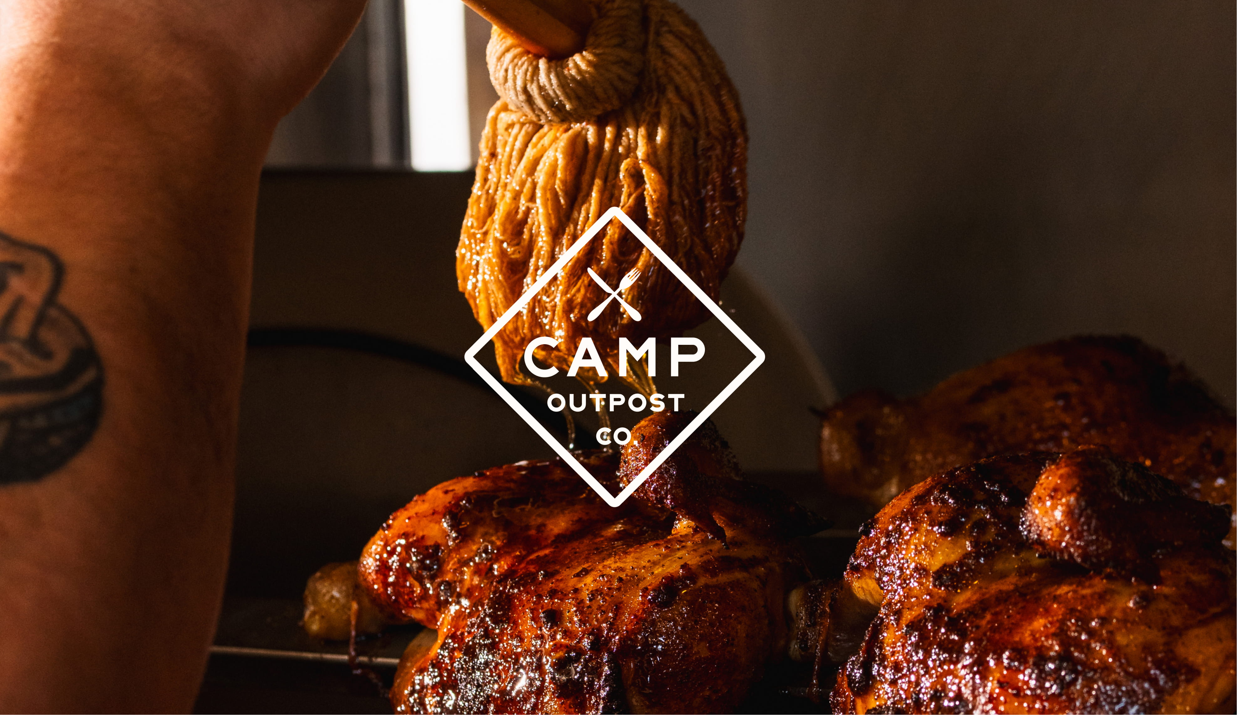
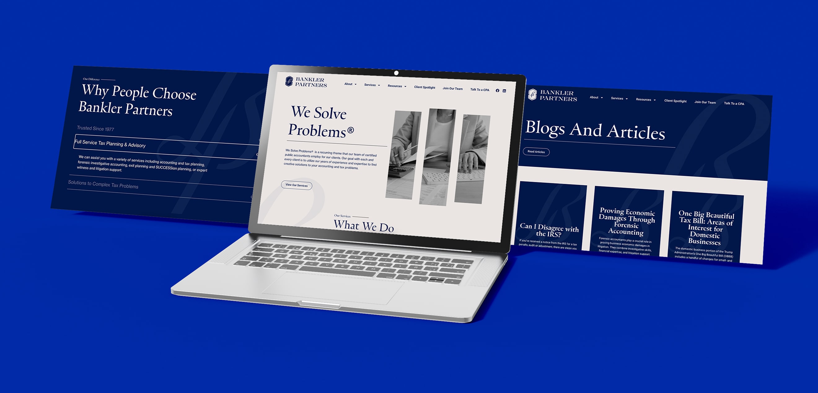
How to Build a Brand From Scratch
Learn the full process of building a brand, from logo sketches and research to website design and brand guide development.
Featured Work
We don’t just deliver - we make a difference.
Here’s a look at some of our most impactful branding, web, and campaign work. These aren’t just projects - they’re proof of what’s possible when bold ideas meet the right tribe.