
Almost every time we work with a new partner we get the same question (and rightfully so), “will my website be mobile friendly?” There’s been a lot of buzz around the importance of mobile for a while now and everyone is right to make sure that their digital efforts are going to be up to par.
This pressure to optimize for a mobile first experience is nothing new for our tribe. However, it is important that we help you understand what mobile-first advances have been made and what this can mean for your digital efforts. Hold onto your seats ladies and gents, the mobile-first internet is officially here.

Google and Mobile Indexing
Google, the king of secrets, has admitted that it will use the mobile version of your site for indexing over your desktop version. Google will only crawl your desktop version if it can’t get the information it needs from the mobile version. This deliberate preference for mobile-first demands a stellar mobile-friendly site and digital strategy.
Digital Strategies for Mobile First Indexing
To be prepared to rock this mobile-first shift, there are several things to be aware of. First, all of your digital content needs to be as high quality on mobile as it is on desktop. Digital content can be anything from website copy, images, videos or even animations. Mobile page load speed, not that there was ever a time it didn’t matter, is crucial now. Slow load times can result in lower SEO rankings. Mobile metadata, the snippets of copy that helps Google organize your site and searchers choose your content, needs be more concise with all keywords towards the beginning. Smaller screen sizes could potentially cut off what on desktop displays perfectly. The list could go on and on, but as long as you show preferential treatment to mobile-friendly options you should be fine.
Tribu is Mobile First
Thankfully, Tribu does not build a desktop version of a website and then a separate mobile version like some. Rather, we develop websites that are responsive. This basically means your website will be smart enough to realize what device it’s being visited on and able to make adjustments to be its best self for the situation. When designed and managed by Tribu, each piece of your website will be optimized to provide a very enjoyable user experience that event the mobile biased Google will appreciate.
Feeling unsure that you’re ready to take on the mobile-first internet?
Let us help you, we love a good challenge from Google!
Let's build a tribe together
Ideas, Ideas, Ideas

Before They Take a Bite, They Visit Your Feed
Discover how thoughtful restaurant content can help guests see the food, feel the experience, and decide to visit.
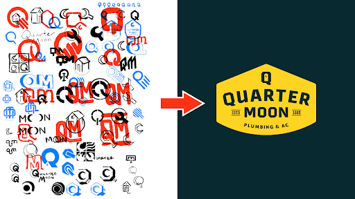
How to Build a Brand From Scratch
Learn the full process of building a brand, from logo sketches and research to website design and brand guide development.
How Social Media Advertising Is Changing in 2026
Discover how brands can adapt to emerging social platforms with content that feels native, useful, and audience-aware.
Featured Work
We don’t just deliver - we make a difference.
Here’s a look at some of our most impactful branding, web, and campaign work. These aren’t just projects - they’re proof of what’s possible when bold ideas meet the right tribe.


.jpg)


