Ideas Post
Balance is Key: How to Create Effective Designs
In today's digital landscape, mobile devices have become an integral part of our lives. We explore the importance of mobile marketing and provide actionable strategies to optimize your mobile marketing efforts.

In the world of graphic design, balance is a fundamental principle that holds immense significance. Just like in any form of art, achieving balance in design is vital for creating aesthetically pleasing and effective visual compositions. Whether you're designing a website, a logo, or a poster, understanding and implementing balance can make all the difference in captivating your audience and conveying your message with clarity and impact. In this blog post, we will explore the importance of balance in graphic design and how it enhances the overall quality of visual communication.
Visual Harmony and Appeal
Balance is the key to achieving visual harmony in design. It involves distributing elements within a composition in a way that feels stable and visually pleasing. When a design lacks balance, it can create a sense of uneasiness or chaos, making it difficult for viewers to engage with the content. By incorporating balance, designers can create a sense of order and coherence, allowing viewers to navigate the composition effortlessly.
Focusing Attention
Balance helps guide the viewer's eye and directs their attention to the most important elements of a design. By strategically placing elements and using contrasting weights, sizes, or colors, designers can emphasize key elements and ensure they stand out. Whether it's a call-to-action button on a website or a headline on a poster, balance allows designers to create focal points that grab attention and convey the intended message effectively.
Enhancing Readability and Understanding
Balance plays a crucial role in enhancing readability and understanding of visual content. Whether it's a typographic layout or an infographic, properly balanced elements make the information more accessible and digestible for the viewer. Balanced typography with appropriate spacing and alignment ensures that text is legible and easy to read. Similarly, a well-balanced infographic uses hierarchy and alignment to organize information logically and intuitively.
Conveying Brand Identity
In the realm of branding, balance is a powerful tool for communicating a brand's identity. A well-balanced logo or brand mark not only establishes visual harmony but also reflects the core values and personality of the brand. Balance can convey a sense of professionalism, creativity, or even playfulness, depending on the brand's desired image. Consistently applying balance throughout brand collateral helps build a strong and recognizable identity, allowing audiences to connect and resonate with the brand on a visual level.
Emotional Impact and User Experience
Balance can evoke emotional responses and enhance the overall user experience. By carefully considering the distribution of elements, designers can create a visual rhythm that engages viewers and evokes the desired emotions. A harmoniously balanced design can communicate a sense of calmness, stability, or excitement, depending on the design's purpose. By creating a positive emotional experience through balance, designers can leave a lasting impression on the audience. As a graphic designer, mastering the art of balance will enable you to create compelling, impactful, and visually stunning designs that captivate your audience and effectively communicate your message. So, embrace balance and let it guide your creative journey to new heights of design excellence.
Let's build a tribe together
Ideas, Ideas, Ideas
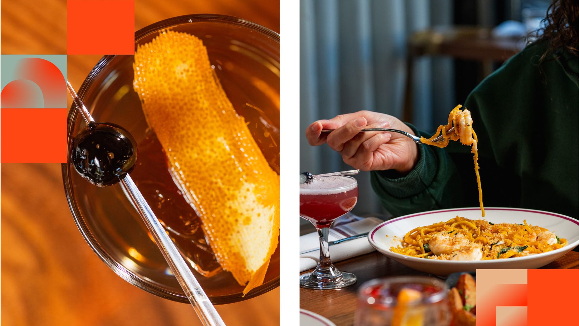
Before They Take a Bite, They Visit Your Feed
Discover how thoughtful restaurant content can help guests see the food, feel the experience, and decide to visit.
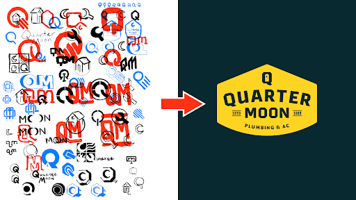
How to Build a Brand From Scratch
Learn the full process of building a brand, from logo sketches and research to website design and brand guide development.
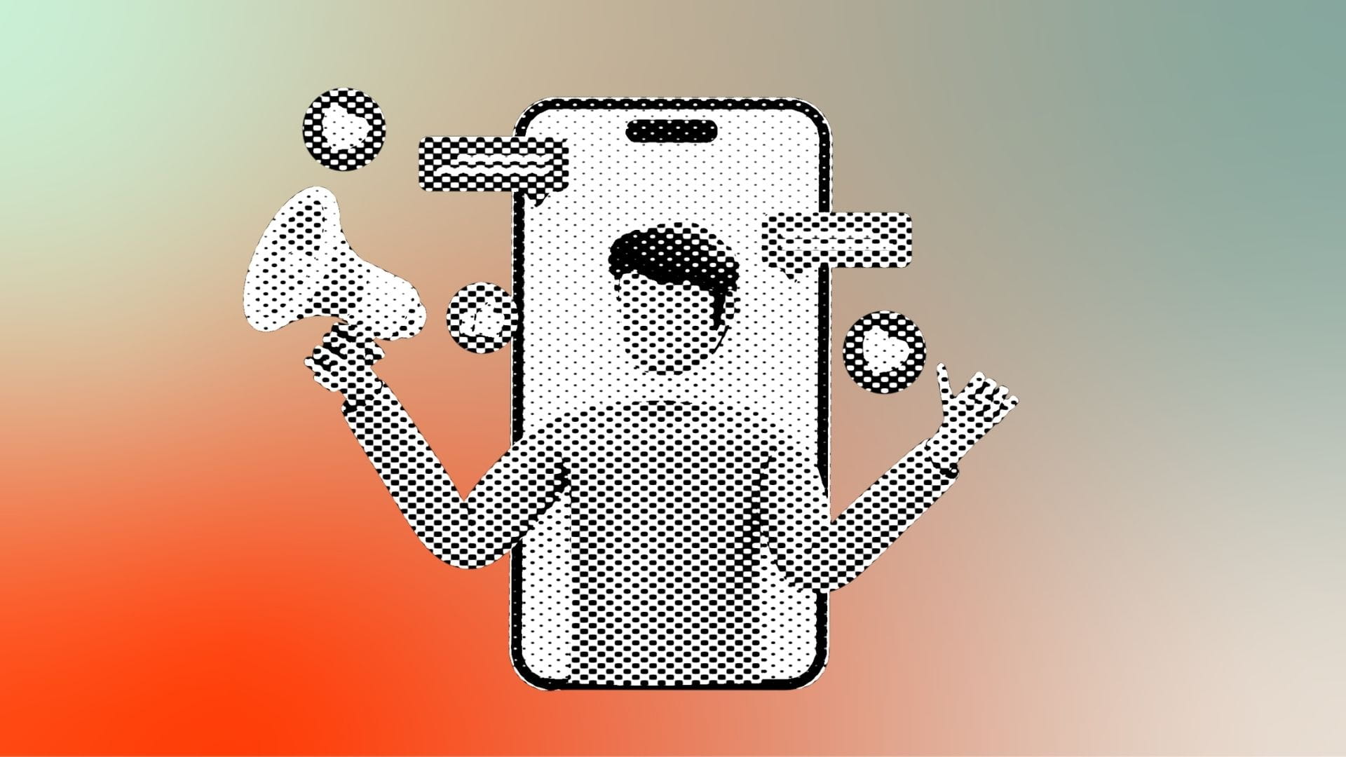
How Social Media Advertising Is Changing in 2026
Discover how brands can adapt to emerging social platforms with content that feels native, useful, and audience-aware.
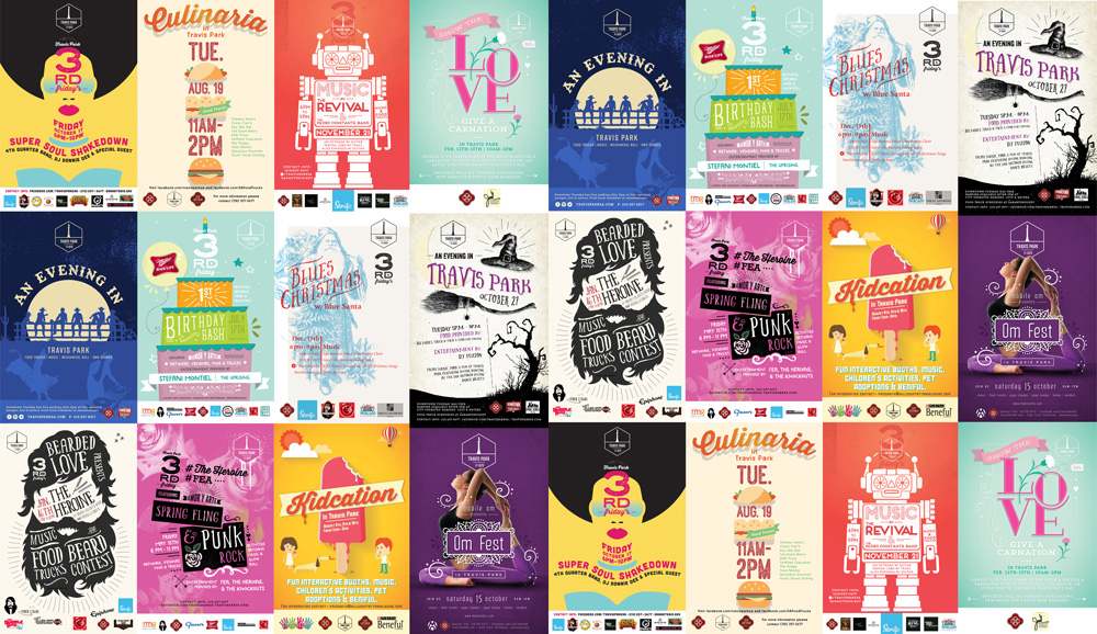
Featured Work
We don’t just deliver - we make a difference.
Here’s a look at some of our most impactful branding, web, and campaign work. These aren’t just projects - they’re proof of what’s possible when bold ideas meet the right tribe.


.jpg)

