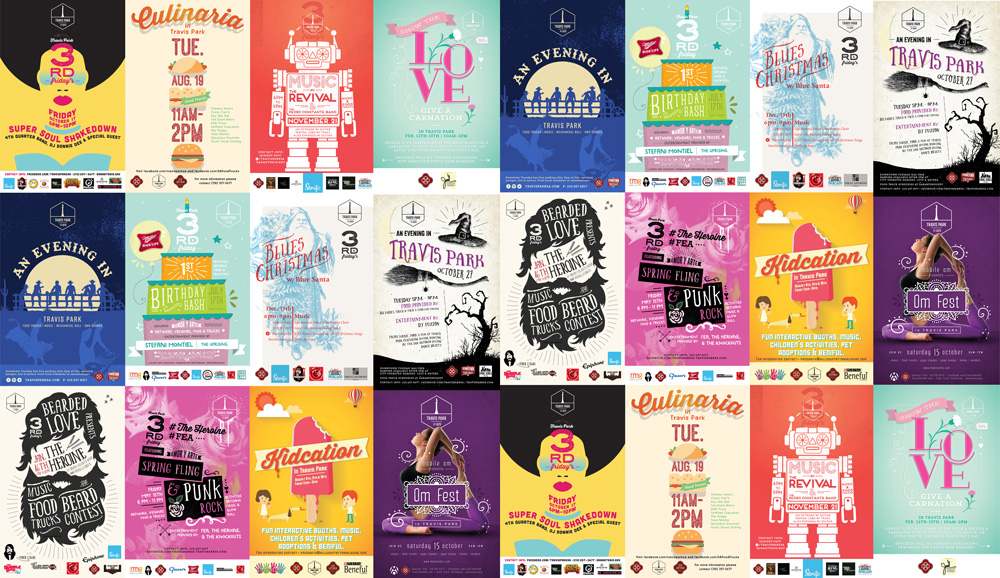
When creating a brand there are several crucial aspects to consider in order to ensure consistency and effectively convey the message of your product. Understanding your brand’s voice, target audience, colors, and typography plays a pivotal role in achieving brand success. Typography is a huge aspect as it is often the initial element someone encounters from your brand – whether it’s an ad on social media, product packaging, or your logo being showcased. In this blog, we dive into the art of selecting the perfect typography for your branding success, ensuring it resonates with your audience.
Why Typography Matters
Type is one of the first impressions your brand gives off. Typography is how your brand communicates to the consumer. It’s the gateway to your brand’s identity and values. Think of it as the voice that speaks directly to your audience before they even read a single word. Typography sets the tone and mood, conveying professionalism, playfulness, modernity, or tradition. Therefore, selecting the appropriate typeface becomes integral to ensuring your brand’s voice is accurately represented.
Choosing the Right Typeface
When picking your typeface you need to understand what you want your brand to say to the customers, are you a mac and cheese brand that caters to the fun and hip young adults like “Goodles,” with their custom bloated type and bold sans-serif for an energetic appeal? Or does your brand cater to a B2B clientele like Microsoft, using clean and universally readable sans-serifs to establish trust and reliability? Each typeface has distinct characteristics that can shape your brand’s personality and influence customer perception. Typefaces have characteristics, so knowing these characteristics when choosing your brand’s type is crucial to making your brand a success.
Navigating the Typeface Landscape
San-serifs and serif fonts are universal choices and versatile for a lot of brand identities. Secondary typefaces are excellent for subheadlines and body copy, offering easy readability and design flexibility. Of course, there are different types of sans serif like bold ones that give a more modern and loud voice, or thin and condensed ones that give off a minimalistic and clean look. When used for main headlines, sans serif evokes a more corporate and vintage feel to your brand, like the New York Times for example. There are many diverse font families that effectively convey distinct messages to your customers.
Typography is a powerful tool that translates your brand’s voice into visual form. By understanding the nuances of typefaces and their impact, you can make informed decisions that resonate with your audience and solidify your brand’s identity. As your brand evolves, your typography can adapt, conveying new messages while maintaining brand consistency.
Check out our blog on the Importance of Color for your brand’s identity.
Let's build a tribe together
Ideas, Ideas, Ideas
Featured Work
We don’t just deliver - we make a difference.
Here’s a look at some of our most impactful branding, web, and campaign work. These aren’t just projects - they’re proof of what’s possible when bold ideas meet the right tribe.


