Ok, we have all been there as designers. Choosing color is hard.
Color takes years to master and even the pros struggle to find that right balance of hue, saturation, and tone. I love color. It is one of the most exciting phases of the process when it comes to developing a new brand. I would have to say I spend a lot of my time designing with colors. Currently, right now the design trend is “Vivid minimalism”. Designs that are bold and simple with bright colors. This is great for flexibility in digital design, and print and it is more likely to stop the scroll on your feed. I also wear crazy colors at the office. That might be why I specialize in bright colors. I literally live in them haha! With so much of our world going digital with social media and AI. It is not surprising that our design choices are simplified. But with simplification, each design decision matters even more including color. Color is when a brand can express itself with just one color.

So what do you do? How can you see color in your design that will enhance it?
Some of the best advice I have been given is to make your color palette have a contrast. Meaning you shouldn't all have some light colors and darker colors. I have experienced times when I was still developing brands and had to make a color pop or fade more into the design because it was either fighting with another. Or the color just did not give me enough flexibility when making assets and designs.

My favorite color pallet approach is the Split Complementary palette. Typically red, blue, and green are what I gravitate to most often. Split Complementary creates a strong contrast without having just one opposite color to use. Our brains like contrast, it is “flashy” and “bold” but having one extra color allows some moments to be not too jarring.

So after you have chosen your main color and what to do next?
Well, this is when those years of experience come into play. Play around with the hue, tint, shade, and tone. These will be your ally. Put the colors next to each other in different ways. Heck, even overlap them! Make the color palette work for you. So get out there, and get coloring! - Hayley
Let's build a tribe together
Ideas, Ideas, Ideas
Why Better Creative Is Becoming the New Targeting
Discover why creative is becoming the new targeting in paid ads and how sharper messaging helps brands attract the right audience and drive action.
Before They Take a Bite, They Visit Your Feed
Discover how thoughtful restaurant content can help guests see the food, feel the experience, and decide to visit.
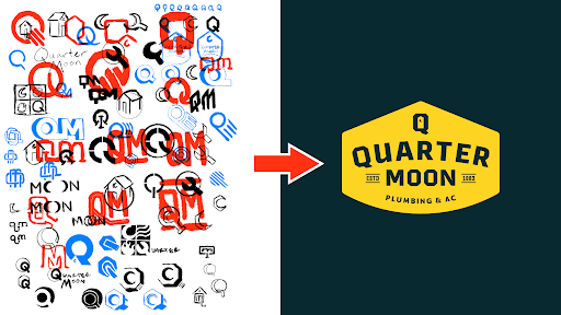
How to Build a Brand From Scratch
Learn the full process of building a brand, from logo sketches and research to website design and brand guide development.
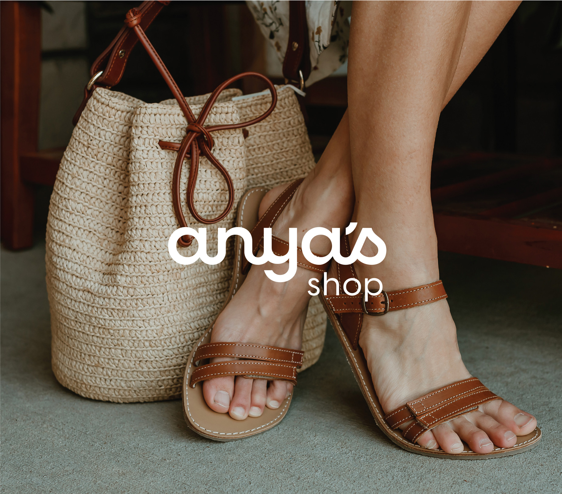
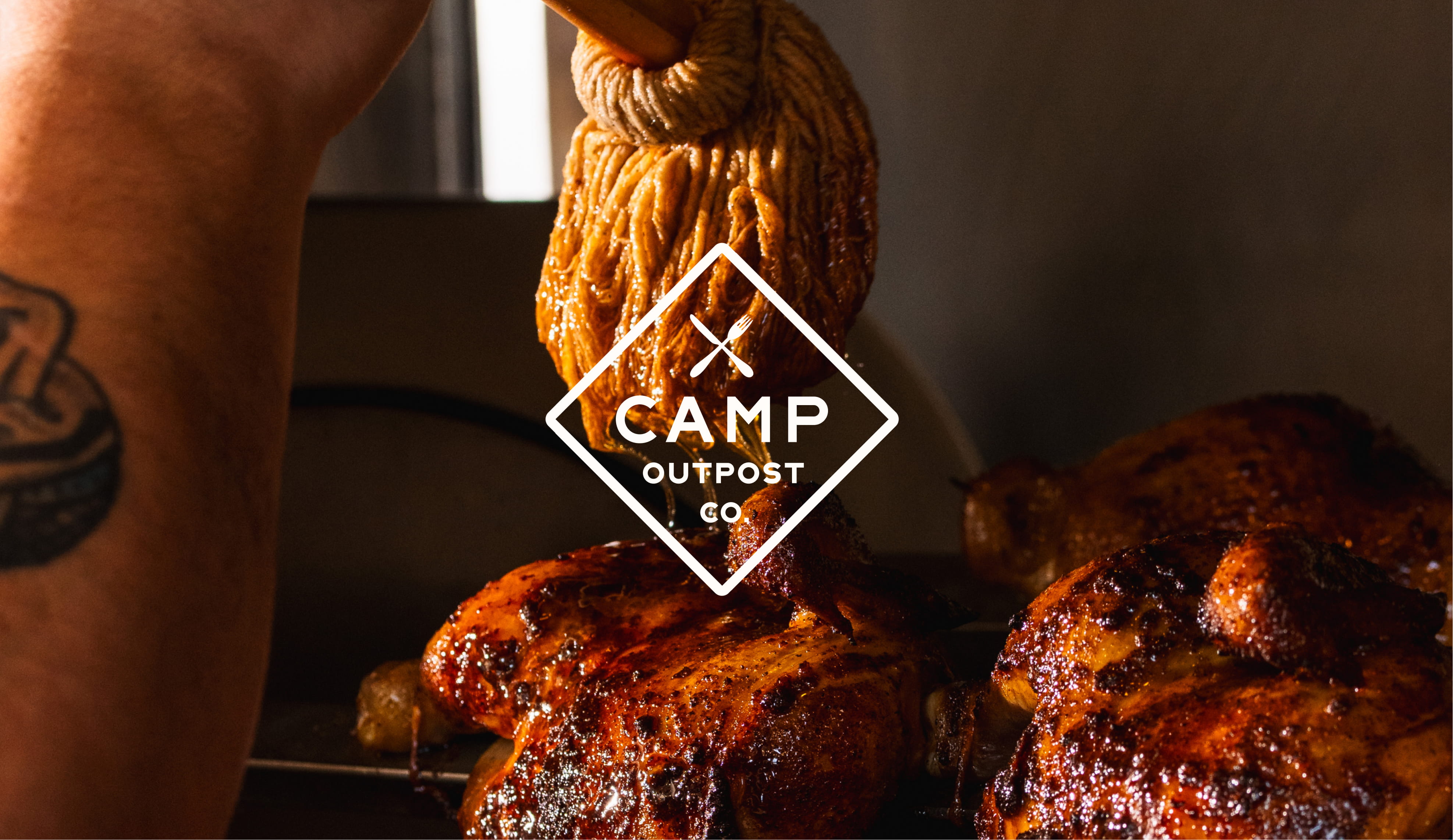
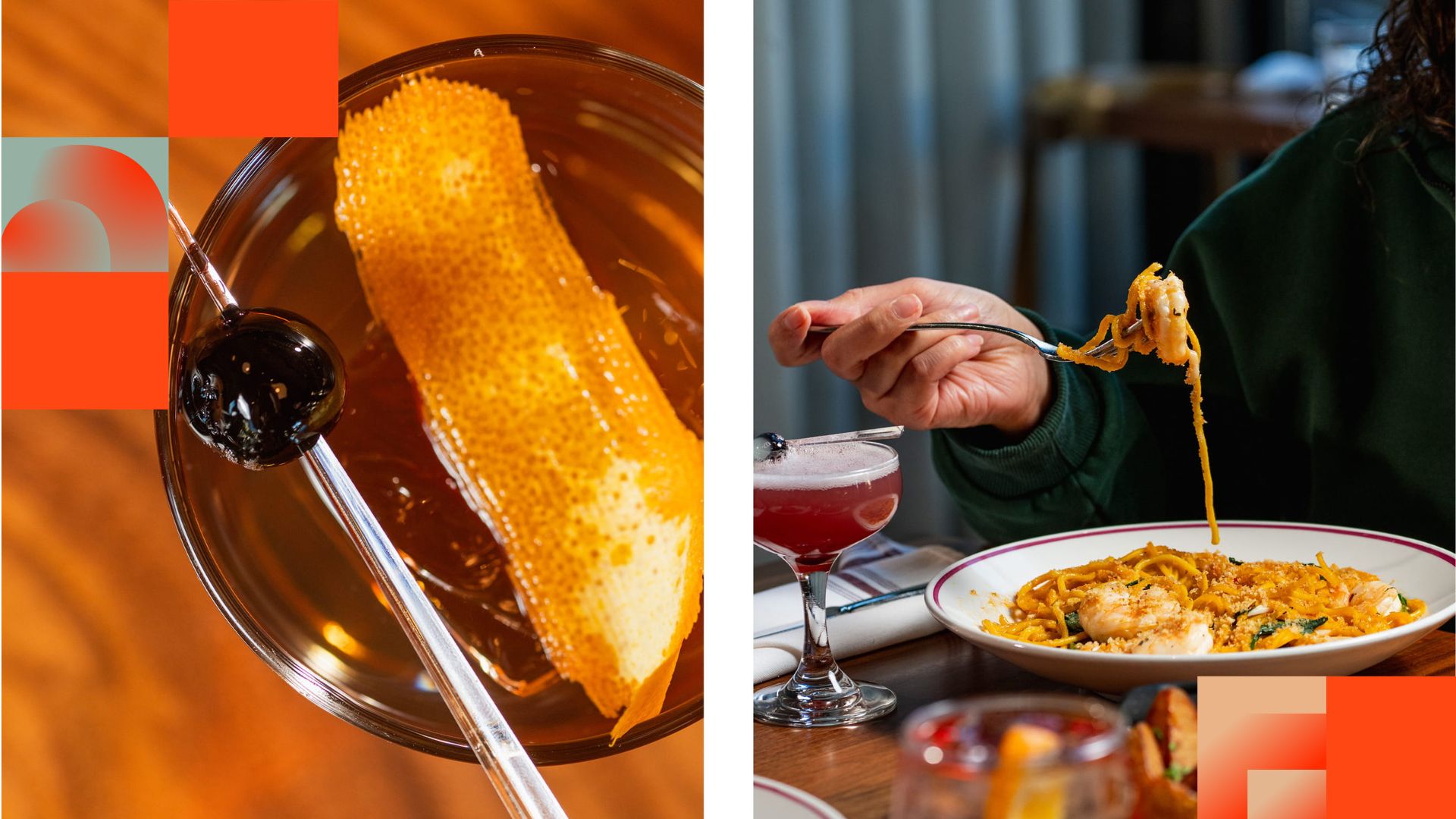
Featured Work
We don’t just deliver - we make a difference.
Here’s a look at some of our most impactful branding, web, and campaign work. These aren’t just projects - they’re proof of what’s possible when bold ideas meet the right tribe.