
Your website isn’t just a homepage anymore; it’s your brand’s handshake, storefront, and customer service desk all rolled into one. And in 2025, there’s no excuse for it not to be mobile-friendly. With more than half of web traffic coming from mobile devices, responsive design isn’t a nice-to-have. It’s a must.
Let’s talk about what responsive web design really means, why mobile-first is the smart play, and how it impacts your business growth.
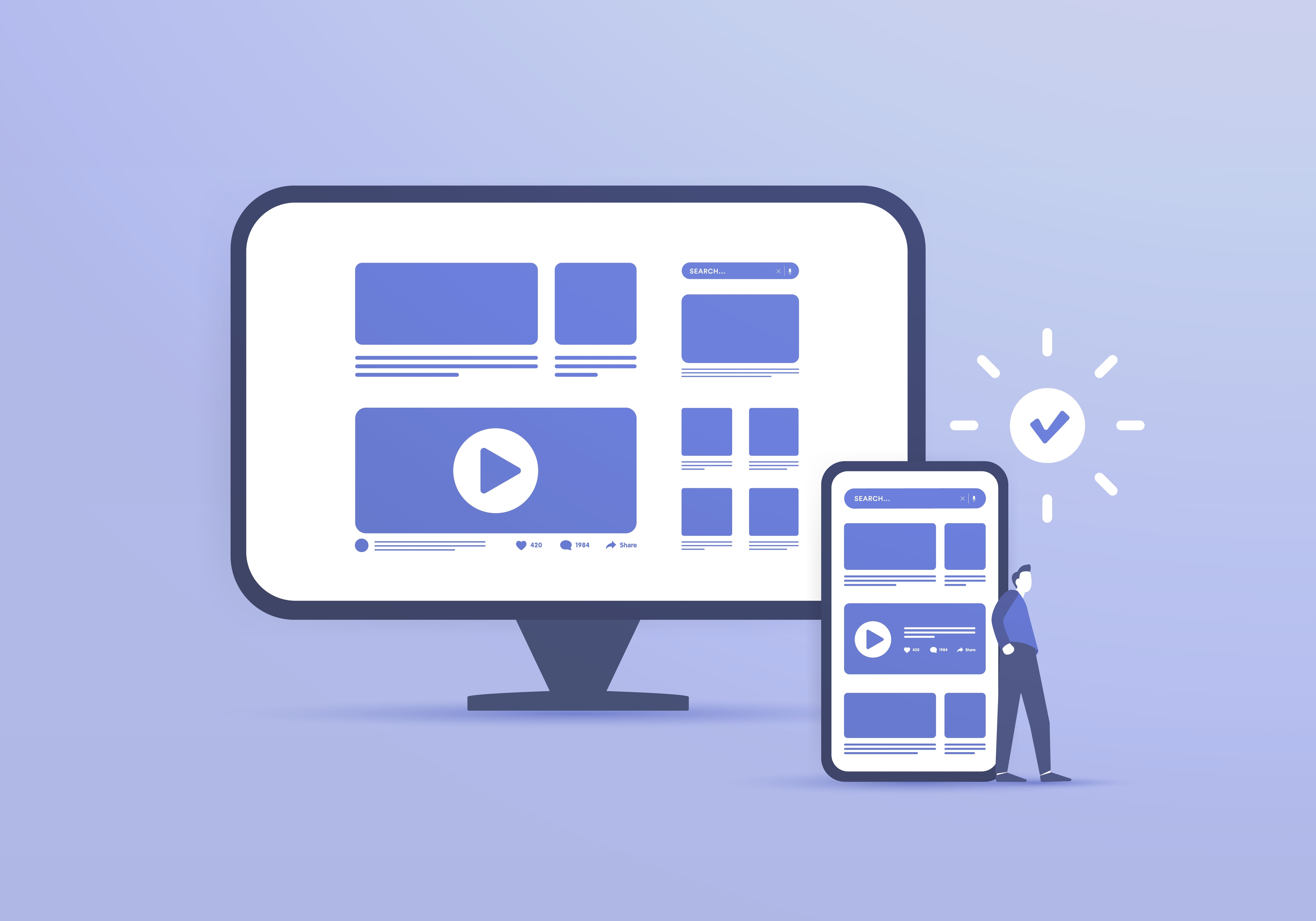
What Is Responsive Web Design?
Responsive web design is an approach where your website automatically adjusts to fit any screen size desktop, tablet, or mobile. Instead of designing one version for computers and another for phones, responsive design uses flexible layouts, fluid grids, and adaptive elements to deliver a seamless experience anywhere.
Why Mobile-First Matters in 2025
1. Mobile Traffic Rules the Internet
It’s not a trend, it's the norm. Most users will find your brand on their phone first, whether through social media, search, or a shared link.
If your site doesn’t look good on mobile, you’ve already lost them.
2. Google Prioritizes Mobile-First Indexing
Google now primarily uses the mobile version of your site for ranking and indexing. That means your search visibility depends heavily on how mobile-friendly your site is.
3. User Expectations Are Higher Than Ever
No one has patience for pinching, zooming, or broken buttons. Today’s users expect smooth navigation, fast load times, and designs that feel natural on mobile.
4. Conversions Happen on Mobile
From online shopping to lead forms, mobile is often where decisions are made. A clunky mobile experience means missed opportunities.
Benefits of Responsive Web Design
- Consistency Across Devices: Build trust by giving users the same brand experience everywhere.
- Better SEO Performance: Google rewards sites that deliver strong mobile UX.
- Cost-Effective: One site that adapts to all devices is easier to maintain than separate versions.
- Future-Proofing: Responsive design adapts to new devices and screen sizes as they emerge.
How to Implement a Mobile-First Mindset
- Start with the Smallest Screen: Design layouts for mobile first, then scale up for larger devices.
- Prioritize Speed: Compress images, streamline code, and cut unnecessary load times.
- Think Thumb-Friendly: Place buttons, menus, and CTAs where they’re easy to tap.
- Test on Multiple Devices: Don’t assume test across operating systems and screen sizes.
Final Thought
In 2025, responsive design isn’t just about looking modern. It’s about meeting your audience where they are and removing barriers between them and your brand. A mobile-first website doesn’t just keep you competitive it helps you win.
Ready to upgrade your digital presence? We design websites that work beautifully across every device. Let’s build your tribe.
Let's build a tribe together
Ideas, Ideas, Ideas
How Social Media Advertising Is Changing in 2026
Discover how brands can adapt to emerging social platforms with content that feels native, useful, and audience-aware.

The Problem With “Our Audience Is Everyone”
See why specific audience insight leads to sharper messaging, stronger creative, and more effective marketing.

AI Made Marketing Content Faster. It Didn’t Make It Better.
Explore how AI changed content marketing and why strong strategy still matters more than speed or volume.
Featured Work
We don’t just deliver - we make a difference.
Here’s a look at some of our most impactful branding, web, and campaign work. These aren’t just projects - they’re proof of what’s possible when bold ideas meet the right tribe.


.gif)
