In the ever-evolving landscape of web design, we’ve noticed a significant shift. From the 960 grid to 1140, and now, sites are becoming even wider. This change corresponds to the increasing size of our screens. But is this the right approach? Why not make the site full width? Do we even need the grid?
The Grid: A Necessity, Not a Constraint
Let’s be clear: grid-based designs are incredibly useful for the web. They create a structure that is necessary for order. We’re not advocating for throwing away the grid, but rather, expanding its constraints and allowing it to be more fluid.
Traditional Grid-Based Designs: Pros and Cons
The grid-based design is a web design framework that uses a predefined number of columns to arrange content. The 960 grid, for instance, is a popular system that uses a fixed width of 960 pixels divided into 12, 16, or 24 columns.
- Pros:
- Consistency: Grid-based designs provide a consistent structure that makes it easy to align elements and create a balanced layout.
- Predictability: Designers can predict how the layout will look on different devices, making it easier to design responsive sites.
- Efficiency: Grids can speed up the design process by providing a reusable framework.
- Cons:
- Lack of Flexibility: Fixed-width grids can be restrictive, making it difficult to create unique and dynamic layouts.
- Responsiveness Issues: As screen sizes continue to vary, fixed-width grids may not provide the best user experience on all devices.
Expanding the Grid: Embracing Fluidity
Rather than strictly breaking away from the grid, modern web design is expanding it. This approach embraces fluid and dynamic layouts that adapt to various screen sizes and orientations.
The Typography Challenge and How VW Units Can Help
Traditional font sizing methods using rem and em units have limitations when it comes to responsive design. rem units are relative to the root element, and em units are relative to the parent element, which can create inconsistencies in font sizing across different screen sizes.
Viewport width (vw) units offer a solution by making font sizes proportional to the viewport. This means that as the screen size changes, the font size adjusts accordingly, providing a more consistent reading experience across devices.
Best Practices for Fluid Typography
- Combine Units: Sometimes, using a combination of rem and vw can offer the best balance between flexibility and readability. For example, using rem for base font sizes and vw for headings can create a harmonious typography system.
- Minimum and Maximum Font Sizes: Use the clamp() function to set minimum and maximum font sizes, ensuring text remains readable on all devices.
- Testing: Regularly test your designs on various devices and screen sizes to ensure they look good and are functional.
Making Your Websites Pop with Fluid Design
Adopting a fluid design approach can make your websites truly stand out, regardless of screen size. By using techniques like fluid containers and viewport-based typography, you can create a dynamic and engaging user experience that will actually use the full size of your consumer’s browser.
Implementing Fluid Concepts: A Simple Example
Here’s how you can apply these strategies to make your websites stand out:

Conclusion: The Future is Fluid
At the end of the day, web design trends are constantly evolving. However, the “fluid” approach seems to be here to stay. It allows websites to adapt to the ever-changing landscape of browsers and devices, providing a better user experience and making your designs more future-proof.
By embracing these modern techniques, you can ensure that your websites not only look great but also perform well across all screen sizes, offering a seamless and enjoyable experience for your users.
Ready to make your website fluid and future-proof? Contact us at Tribu, your trusted San Antonio marketing and web design agency, to get started!
Let's build a tribe together
Ideas, Ideas, Ideas

How Social Media Advertising Is Changing in 2026
Discover how brands can adapt to emerging social platforms with content that feels native, useful, and audience-aware.

The Problem With “Our Audience Is Everyone”
See why specific audience insight leads to sharper messaging, stronger creative, and more effective marketing.
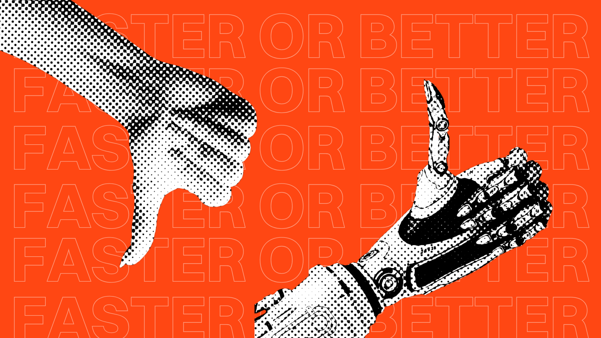
AI Made Marketing Content Faster. It Didn’t Make It Better.
Explore how AI changed content marketing and why strong strategy still matters more than speed or volume.
Featured Work
We don’t just deliver - we make a difference.
Here’s a look at some of our most impactful branding, web, and campaign work. These aren’t just projects - they’re proof of what’s possible when bold ideas meet the right tribe.


.jpg)
.jpg)