We are over a month into 2019 and some exciting design trends are starting to emerge. I have searched my way through the internet and below are the top five trends I see developing throughout 2019.
More Video
Video content is nothing new, but what is new is how Google is indexing sites with video. Google is now ranking website with videos above standard sites. This is leading companies to spend more resources on video production. So be prepared to see not just more embedded videos, but also more video backgrounds and animations.
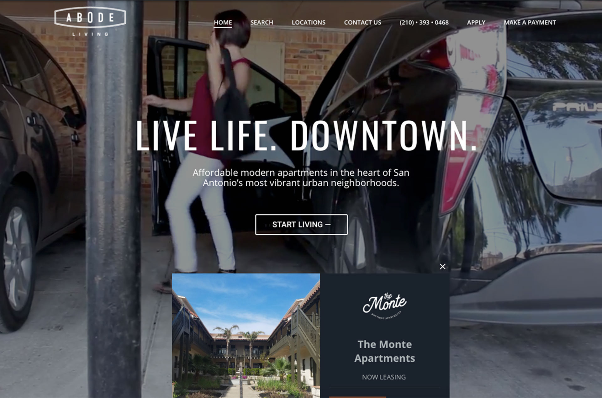
Abode Living uses background videos in their hero section to create a more young and active atmosphere.
Organic Design Elements
In an effort to ditch the monotonous geometric layouts of the past, designers are starting to incorporate more fluid shapes and lines. By utilizing these organic shapes, often pulling inspiration from nature and life, websites feel more approachable and in line with human nature.
As we continue through 2019 the typical shapes designers have utilized (circles, squares, etc) will start to be replaced by more organic shapes and lines.

IOTA uses organic shapes and lines throughout their website to call attention to various headlines and images.
Retro Design
As we move past flat design, experimentation with nostalgic and retro designs are on the rise. The interesting thing about utilizing retro designs in websites is that it is often introducing the audience to those styles for the first time, making them appear “new”. I wouldn’t be surprised to find designers utilizing everything from vintage serif typefaces to color palettes from the 1980s.

bigelowchemists.com utilizes vintage typeface, ornate borders, and distressed textures to create a retro design.
Overlapping Elements
Another way designers are bringing more visual interest to websites in 2019 is through overlapping shapes. When done well, overlapping shapes can enhance the aesthetics of the page and create a clearer visual hierarchy. I suspect in 2019 designers will start experimenting with overlapping shapes to create a more 3-dimensional experience.

Beer N’ All uses overlapping shapes in their hero area to create more visual interest.
Adventurous Type
2018 may have been the renaissance of the of the serif font, but it seems 2019 is going to be about showing off our eccentric, more nostalgic side – at least for headlines. Even company’s that have gone for more minimalistic logos have opted to include bold fonts for headlines.

In contrast to their logotype, Abstract uses Vesterbro Black typeface for their headings.
Like our work?
Contact us and let us make your project shine!
Let's build a tribe together
Ideas, Ideas, Ideas
Featured Work
We don’t just deliver - we make a difference.
Here’s a look at some of our most impactful branding, web, and campaign work. These aren’t just projects - they’re proof of what’s possible when bold ideas meet the right tribe.
