Ideas Post
The Flattening: Why Brands Are Simplifying
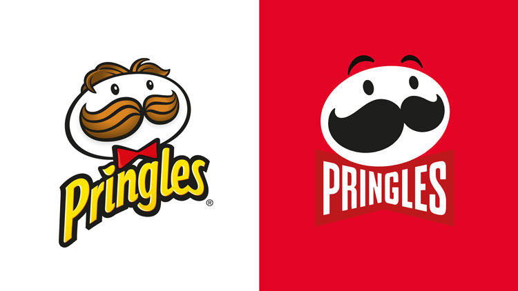
Most people can remember where they were on the day they learned Mr. Pringle had undergone logo reconstructive surgery. Pringles, an iconic brand that had stayed firm in its visual identity for nearly 25 years, had decided to trim back on the decorative elements on its cans and move to a more minimal, simplistic direction...

Most people can remember where they were on the day they learned Mr. Pringle had undergone logo reconstructive surgery. Pringles, an iconic brand that had stayed firm in its visual identity for nearly 25 years, had decided to trim back on the decorative elements on its cans and move to a more minimal, simplistic direction, or in other words minimalist branding. Gone were the fun letter shadows, playful lines, and Mr. Pringle’s luscious locks.More and more, brands are trying to push their brands to a point of simplicity that might seem innovative to some and generic to others. Why is everyone doing this, and is it a model a brand should adopt?
Flexibility
This is probably what is causing this trend to rise in popularity; it's also the most practical explanation. In 1986, Pringles only had to worry about putting their Main Man on cans, print advertisements, and the occasional TV commercial. Now, everything is about the digital experience. Pringles has to consider its website and social media, which require Mr. Pringle to be exported, interlaced, and shrunk down to the size of a favicon. Is a user going to get confused with navigating the Pringles website on their phone if there are some crazy ’90s design shenanigans going on with the home page? A minimal UI is simply going to be easier and more reliable for users./*! elementor - v3.7.8 - 02-10-2022 */.elementor-widget-image{text-align:center}.elementor-widget-image a{display:inline-block}.elementor-widget-image a img[src$=".svg"]{width:48px}.elementor-widget-image img{vertical-align:middle;display:inline-block}

It's definitely possible to maintain some complexities in the new digital age, but going minimal ensures that everything will look consistent, clean, and visually appealing across everything. Minimalist branding is simply the most practical solution if a brand wants to grow and be on everyone’s radar.
Deeper Storytelling
A neat little trick Pringle’s is using for their new cans is giving Mr. Pringle an expression based on what the Pringles taste like. Classic flavors like “Original”, “Cheddar” and “BBQ Sauce” maintain the classic Mr. Pringle stare, while spicy flavors like “Hot & Spicy” have Mr. Pringle wincing at the burning sensation you’ll get when you eat them. Savory flavors even have the mascot giving the buyer a side glance, indicating the, erm, “saucy” flavor. This is an incredibly clever way to indicate the spice or flavor level without needing to slap a little graphic of a pepper filled in halfway on the packaging. It takes what already exists in that space and finds a way to incorporate it into the brand, making it more memorable.

Brands, which have incorporated the minimalist branding concept, have to find clever ways to make themselves stand out besides flashy colors and skeuomorphic shapes. When done right, stripping a brand down to its core essence and building everything to fit into a minimalist aesthetic can create a unique, iconic, and playful experience.
Should this be the "brand standard"?
That depends. The better question would be “will minimizing elevate a brand?” A good example of trying and failing is GAP’s disastrous redesign in 2010.Following the financial crisis of 2008, GAP’s CEO decided to take the iconic (already minimal look, mind you) and try to rebrand in a desperate attempt to boost sales. What resulted in this million-dollar refresh was, well, problematic.

Is it bad? I think one could make an argument that, just as a logo, it’s ok. It’s a pretty standard if not bland corporate mark. As a brand, however, it’s atrocious, and completely misrepresents the company’s product and message. What 20-something year old at the mall or parent with young kids is going to connect with this? How does this even begin to describe what GAP is all about?The original logo has a unique, tall serif that suggests sophistication and style, and the square feels almost like a clothing tag. These two things already define GAP incredibly well and didn't need to be deconstructed any further. This rebrand was such an off-message to its customers that they reverted to the old logo within a week and the CEO resigned in disgrace.So should the trend be embraced? There will always be controversy when redesigning a beloved brand, but if it's done right the long term benefits make it worth it.I think minimal brands are cool, sleek and appealing whenever they understand their mission and focus their visual style on that. Minimalism will not go away, and if a brand wants to jump on the train, they need to make sure they know who they are before committing.
Let's build a tribe together
Ideas, Ideas, Ideas
Featured Work
We don’t just deliver - we make a difference.
Here’s a look at some of our most impactful branding, web, and campaign work. These aren’t just projects - they’re proof of what’s possible when bold ideas meet the right tribe.


