At Tribu, we’re all about creating experiences that spark emotion and build lasting connections. Today, we’re diving into the creative underworld where graphic design meets the thrill of horror movies. Let’s unmask how bold visuals and smart typography come together to form unforgettable, spine-tingling poster art.
How Design Creates the Thrill
Horror movie posters are more than just spooky images—they’re masterclasses in storytelling. By mixing dramatic colors, clever typefaces, and innovative visual effects, designers capture the mood without giving away the plot. Here’s what makes them stand out:
- Bold Color Schemes: Dark hues like black, gray, red, and purple set the tone and stir up feelings of suspense.
- Strategic Use of Negative Space: Leaving parts of the poster to the imagination builds tension and curiosity.
- Iconic Symbols: Carefully placed imagery draws viewers into the story while hinting at the mystery ahead.
- Visual Effects: Techniques such as image distortion and multi-frame splits add layers of disorientation and excitement.
A Closer Look at Iconic Posters
We can’t talk about horror design without nodding to some unforgettable examples:
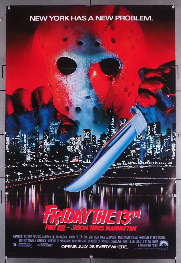
1. Friday the 13th Poster: Utilizes ominous colors and rugged textures to evoke dread.

2. The Exorcist Poster: Balances eerie typography with stark visual contrasts for maximum impact.

3. Pearl Poster: Merges minimalist elements with bold imagery to create a suspenseful narrative.

Each poster demonstrates the creative risk-taking we admire at Tribu—bold moves that build trust and respect with audiences, much like our own approach to crafting tribe-worthy brands.
Local Creativity Meets Global Trends
Our creative community thrives on fresh, regional design trends that inspire us to push boundaries every day. Whether you’re a local business looking to make an impact or a brand ready to embrace innovative marketing, understanding these design principles can set you apart. At Tribu, we offer a range of services—from visual identity and brand strategy to organic social media and SEO—to help you build a brand people love.
Bringing It All Together
A successful horror movie poster doesn’t just capture attention—it creates an experience. The blend of eye-catching visuals, smart typography, and a touch of mystery delivers a message that resonates deeply with audiences. We believe in designing with empathy and boldness, ensuring every element speaks directly to your tribe’s heart.
Ready to transform your brand’s visual story? Contact us today and let’s start building tribes together.
Let's build a tribe together
Ideas, Ideas, Ideas
Featured Work
We don’t just deliver - we make a difference.
Here’s a look at some of our most impactful branding, web, and campaign work. These aren’t just projects - they’re proof of what’s possible when bold ideas meet the right tribe.


