Graphic design is a field with many subfields. One of these subfields is movie poster design. A movie's poster is an important part of its marketing campaign and helps to create the movie's persona. As with any other type of design, there are good examples and bad examples of movie posters. But it is up to each person to decide what they think is good or bad. A good movie poster design should be eye-catching, creative, and informative. The title of the movie is important, but it shouldn't be the only thing on the poster. The poster should also be creative, suggesting what the movie is about without giving too much away. If a poster isn't eye-catching or informative, then it should at least be creative. Recently, I’ve noticed a trend for movie poster designs consisting of floating heads, bland layouts, and subpar creativity. You see some of the biggest blockbusters within one of the most creative industries there is. Take, for example, the Last Night in SoHo film.


The first poster you see is the original. At first glance, it does seem pretty stylized, and quite well-suited for the movie. What lacks for me is creativity, as I mentioned before, most movie posters these days go for the floating heads and title look. This may not be toeing the line with 'not so good', but is definitely a contender for 'not that original'. On the other hand, the second poster is an original piece by artist MikeSapienzaDesigns I found on Etsy. This piece is so much more impactful, consisting of conceptual art that you may only understand if you watch the movie, drawing the intrigue of the audience and creating curiosity. I understand the need the appeal to a mass audience, but as a designer looking at this objectively - creativity is king. There is so much more depth to the second poster, communicating the idea of the movie, and doing so in an extremely creative way. This is no isolated incident, and there are so many more examples. I'll give you just one more though. The Irishman is a Netflix film that was released in 2019, with some pretty big names tied to it. So I guess I understand why the original movie poster is 3 men from the waist up, taking up about 80% of the poster.


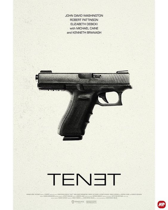
The original poster displays the main characters well. But that's about it. There isn't much to say about it besides that it meets every standard for the normal Hollywood poster. In contrast, this poster by artists Tony Stella and Ian Keltie is a very creative take on the visualization of the story within the film. From the color choice to the clever illustration - this poster has got it all. There are many conceptual posters out there that contain what many movie enthusiasts desire when it comes to the movie poster. There are reasons why Hollywood uses the floating head technique, and they are valid. However, they remain uncreative and bland. In closing, I will leave you with a few examples of very clever movie posters I've found on the internet. After seeing some of these examples, you'll never look at movie posters the same.


Let's build a tribe together
Ideas, Ideas, Ideas

Before They Take a Bite, They Visit Your Feed
Discover how thoughtful restaurant content can help guests see the food, feel the experience, and decide to visit.
How to Build a Brand From Scratch
Learn the full process of building a brand, from logo sketches and research to website design and brand guide development.

How Social Media Advertising Is Changing in 2026
Discover how brands can adapt to emerging social platforms with content that feels native, useful, and audience-aware.
Featured Work
We don’t just deliver - we make a difference.
Here’s a look at some of our most impactful branding, web, and campaign work. These aren’t just projects - they’re proof of what’s possible when bold ideas meet the right tribe.