
You’ve probably heard the phrase “your vibe attracts your tribe.” Well, color is a huge part of that vibe. In branding, color isn’t just a visual choice—it’s a strategic move that shapes how people feel about your business from the second they see it.
So, yeah—your palette matters.
The Science Behind the Hue
Color psychology is the science of how color influences human emotion and behavior—and it’s a game-changer in branding. Studies show people form first impressions within 90 seconds, and up to 90% of that judgment is based on color alone. That’s because our brains process color faster than words, linking it instantly to feelings and associations. Red feels urgent and bold, blue is calming and trustworthy, yellow sparks optimism, and green signals health or growth. These responses are shaped by both culture and evolution, making your color palette far more than just a design choice—it’s a strategic tool that sets the emotional tone of your brand and shapes how people perceive and connect with it.
Here’s what that means in action:
- Red = Bold, passionate, action-packed
- Blue = Trustworthy, calm, reliable
- Yellow = Optimistic, cheerful, attention-grabbing
- Green = Natural, balanced, growth-focused
- Black = Sophisticated, powerful, luxe
- Pink = Playful, fresh, expressive
These aren’t hard rules (context matters), but they’re strong cues. Color helps you signal your brand’s personality before anyone even reads your name.
Matching Color to Strategy
Here’s where it gets smart: great branding uses color to reinforce what a brand stands for. If your business is about innovation and energy, a soft beige palette probably isn’t the move. Likewise, if your brand is all about trust and expertise, neon orange may not land the way you want.
At Tribu, we dig deep into brand strategy before we even open the color picker. We ask questions like:
- What do we want people to feel?
- Who are we talking to?
- What’s our brand’s voice?
Your color palette becomes a tool—not just a trend.
Consistency = Connection
Here’s the deal: when your brand’s color game is on point (and consistent), you start building recognition and trust without saying a word. That’s how you create a tribe—people see your posts, packaging, or website and instantly feel like they’re in the right place.
The proof? Brands like Spotify, Tiffany & Co., and Coca-Cola don’t just use color—they own it. And they do it by staying consistent across every single touchpoint.
Your Palette Isn’t Just Pretty
It’s strategic. It’s emotional. It’s the front door to your brand. Before anyone reads a word or clicks a button, they feel your colors. That first impression? It’s powerful. Whether you’re building from scratch or refining what already exists, your palette should do more than follow trends—it should speak to your people. Evoke trust. Spark curiosity. It feels like home. Because the right colors don’t just catch the eye—they build connections. Make sure yours are more than just trendy. Make them tribe-worthy.
Ready to build a visual identity people actually remember? We’d be honored to help. Let’s build your tribe .
Let's build a tribe together
Ideas, Ideas, Ideas
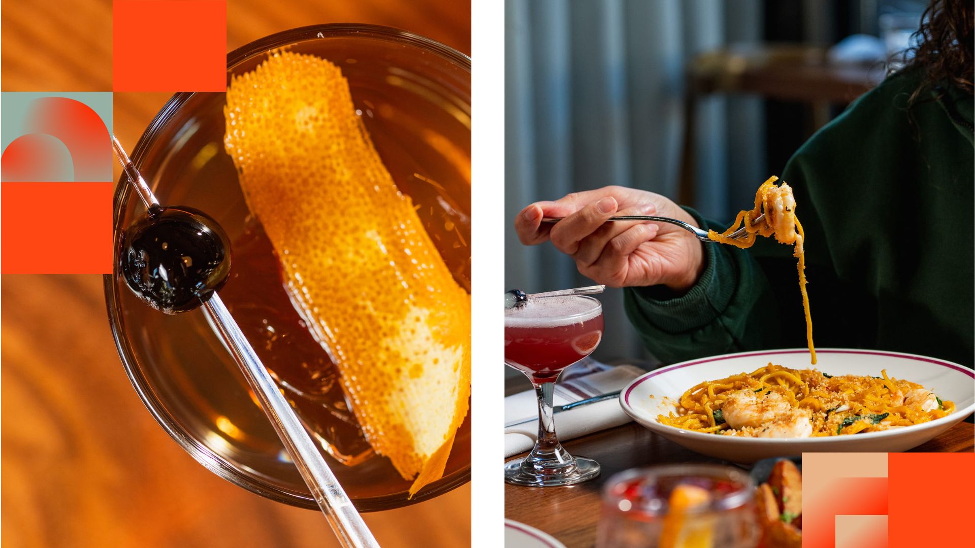
Before They Take a Bite, They Visit Your Feed
Discover how thoughtful restaurant content can help guests see the food, feel the experience, and decide to visit.
How to Build a Brand From Scratch
Learn the full process of building a brand, from logo sketches and research to website design and brand guide development.

How Social Media Advertising Is Changing in 2026
Discover how brands can adapt to emerging social platforms with content that feels native, useful, and audience-aware.
Featured Work
We don’t just deliver - we make a difference.
Here’s a look at some of our most impactful branding, web, and campaign work. These aren’t just projects - they’re proof of what’s possible when bold ideas meet the right tribe.


